vscode: Error hover semantic information should be rendered separate of error message
This is a regression on the diagnostics display.
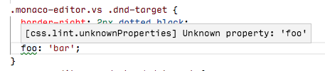
1.28:
Insiders:
In both case, the diagnostics returned are:
const diagnostics = {
  code: "unknownProperties",
  source: "css.lint.unknownProperties",
  message: "Unknown property: 'foo1'"
}

If we have access to semantic information we should render it much better. The message should come first. Then the source on a separate line, with a Source: label preceding it and in non-monospace font (since source should be a user-readable string like CSS Lint). Then, the code with the same style, but with monospace, since code is often a library/OS error code. Something like:
Unknown property: 'foo1'Source: CSS Lint Code:
unknownProperties
About this issue
- Original URL
- State: closed
- Created 6 years ago
- Reactions: 2
- Comments: 36 (33 by maintainers)
Commits related to this issue
- #62370 Render source and code less prominent — committed to microsoft/vscode by sandy081 6 years ago
- #62370 Improve hover UI — committed to microsoft/vscode by sandy081 6 years ago
I vote for Option 3. Imho a user is not interested in the source and of course not the code. I would always render source and code in the problems panel such that users who are interested in this can go to the view that provides more details. Similar analogy is debug hover, gives you minimalistic information, if you want more please open the debug viewlet.
If we decide to go with option 2 I suggest to right align it so it is less noticable and less space between it and the actual error.
Another idea from (@glen-84) is to have everything in single line and left aligned. Some realtime examples:
Edit: Credits to @glen-84 😃
Another suggestion from @egamma is to inline the source and code with the message without labels
I think first we have to decide whether the metadata should be shown at all, or whether it should be configurable to be hidden, etc. Then, if it’s shown, how it should be displayed.
I think it should be shown because if I have multiple extensions contributing diagnostics, I want to know where a message is coming from. The error code is also useful, e.g. if you want to know which rule in a tslint.json is associated with an error message. I prefer option 1.
While that is true, isn’t the real question what value the
codeattribute has at all? Usually this is a number and for css its seems to be a close variant of the message. Are people reading/understanding diagnostics like: “Oh errorTS33165, I better not assign a boolean to a string” or do they understand the message “Type boolean cannot be assigned to type string” better/faster? For me the code is something I would use when googling a problem I don’t understand by reading the message and therefore the least important piece of information.Fixes for his have caused regression for https://github.com/rust-lang/rls-vscode. We used backtick-enclosed strings for types and since everything is escaped now to render a custom hover window, the error messages are illegible now, for example:
current output
note: expected type
std::option::Option<std::string::String>found typestd::option::Option<&std::string::String>previous output
note: expected type
std::option::Option<std::string::String>found typestd::option::Option<&std::string::String>See https://github.com/rust-lang/rls-vscode/issues/479 for more details.
I feel so ignored. 😄
There have been too many iterations done on this and thanks to all for the suggestions. Since it is highly individual opinionated, I would collect more feedback on the current approach before changing and going in circles.
There’s no consistency. Problems View:
Inline View:
I also don’t like the code/source appended to the last line’s message. If not on a new line, I hope they can be right-aligned.
This is how it looks when I align it to right. Not sure right alignment looks good for all. May be it is better to go with left alignment?
This is what I meant:
code, often the ruleId, should be linkable. That’s https://github.com/Microsoft/vscode/issues/11847 but not https://github.com/Microsoft/vscode/issues/54272.Made Hover consistent with Inline and Problems view
This is the best can be done before introducing more UI changes. I would not invest more as the current approach is OKish and do not see complains from users.