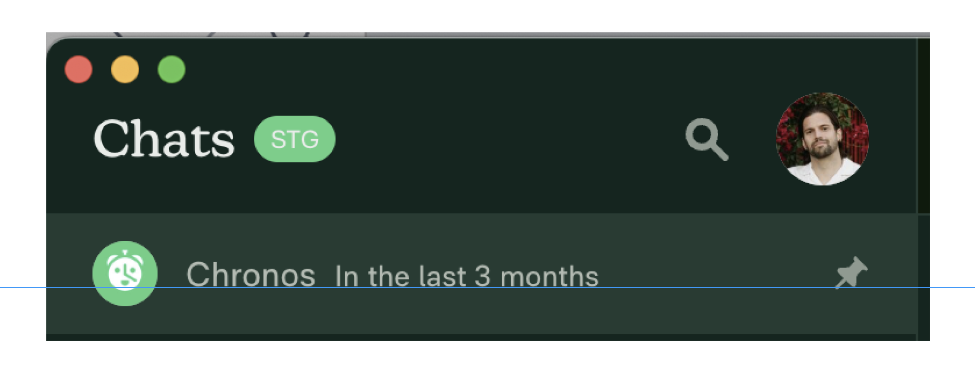
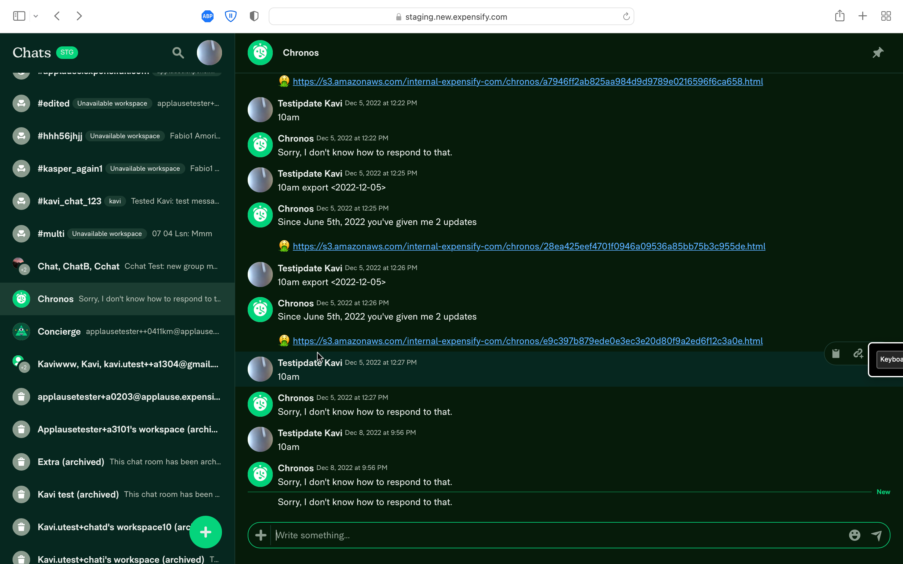
App: [$1000] Baseline of the recipient name and message preview do not line up in LHN
If you haven’t already, check out our contributing guidelines for onboarding and email contributors@expensify.com to request to join our Slack channel!
Action Performed:
- Open NewDot
- Set
Priority modeto focus in preferences - Observe the chat list in the LHN
Expected Result:
Baseline of the recipient name and message preview should be aligned
Actual Result:
the baseline of the recipient name and message preview do not line up.
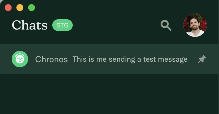 Ideally the message preview line would be shifted downwards about 1-2px.
Workaround:
unknown
Platforms:
Which of our officially supported platforms is this issue occurring on?
- Android / native
- Android / Chrome
- iOS / native
- iOS / Safari
- MacOS / Chrome / Safari
- MacOS / Desktop
Version Number: 1.2.50-14
Reproducible in staging?: y
Reproducible in production?: y
If this was caught during regression testing, add the test name, ID and link from TestRail:
Email or phone of affected tester (no customers):
Logs: https://stackoverflow.com/c/expensify/questions/4856
Notes/Photos/Videos:

Expensify/Expensify Issue URL: Issue reported by: @shawnborton Slack conversation: https://expensify.slack.com/archives/C049HHMV9SM/p1673202521146459
Upwork Automation - Do Not Edit
- Upwork Job URL: https://www.upwork.com/jobs/~01e29f396b115e95bc
- Upwork Job ID: 1612943799700762624
- Last Price Increase: 2023-01-10
About this issue
- Original URL
- State: closed
- Created a year ago
- Comments: 137 (114 by maintainers)
@anmurali I think you paid me twice. Can you request a refund of $1k? TIA
Regression Test Proposal
focusin preferencesDo we agree 👍 or 👎
@aneequeahmad If you have limited availability, I can create a PR as well.
@anmurali, could you take a look at this please?
@aneequeahmad There’s an issue on Android with alignment. Can you take a look? https://github.com/Expensify/App/pull/15319
@aneequeahmad I’m on it.
I agree, combining both solutions is the best approach 🎀👀🎀 C+ reviewed!
@luacmartins On web, there couldn’t be a better fix then using the native
align-items: baseline. Since its not implemented properly on react-native, that does not mean that we should not use it on web. I think combining both of these solutions make more sense here.Thanks for the summary @aneequeahmad! IMO we should use the same solution we implemented for the sender name + timestamp. Does that not work here? Is that
Proposal 2you mentioned above?@chiragsalian There was another same misalignment issue of name and date and that is fixed and deployed on production.
There is no android specific check used in this fix, here is the PR for code reference. Maybe @luacmartins can give an opinion that would help us to decide the solution for this problem and also create a reusable single style
@chiragsalian, I also see the message being off by 2px
I’m confused as to why first message is more off that the second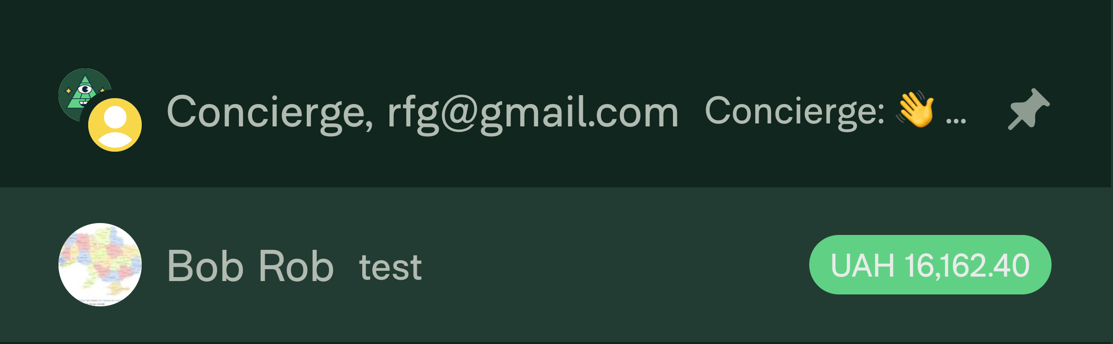
@shawnborton You’re right platform-specific solution isn’t bullet proof, Also, adding 1px padding isn’t bullet proof as well. This issue is fixed by my proposal which is simple and a well tested fact by the community
I have tested on Android, IOS, Web/Desktop its working fine.
Note: Also i have noticed that the current issue also exist on Android but its less than 1px. Which is also fixed by my proposal.
Personally I think this is fine, it doesn’t actually increase the line height per se, just the height of the wrapper that wraps the sender and preview line. Either way though, it looks optically vertically centered which is what we want. So using
baselineis still my preference.