bootstrap: .invalid-feedback doesn't show for .input-group with an invalid control
Example:
<div class="form-group col-md-4">
  <label class="form-control-label is-invalid" for="valuation_value">Estimated Value</label>
  <div class="input-group is-invalid">
    <span class="input-group-addon">£</span>
    <input class="form-control is-invalid" min="0" type="number" value="" name="valuation[value]">
  </div>
  <div class="invalid-feedback">can't be blank, is not a number</div>
</div>
Results in:
I would expect to see can't be blank, is not a number under the input-group.
About this issue
- Original URL
- State: closed
- Created 7 years ago
- Reactions: 77
- Comments: 88 (27 by maintainers)
Links to this issue
Commits related to this issue
- Extended product edit form with missing fields, hacking BS4 validation Bootstrap 4's validation has changed since last alpha and is still being cooked. See: https://github.com/twbs/bootstrap/issues/2... — committed to vanilophp/framework by fulopattila122 7 years ago
- Signup form validation setup * Uses laravel validation on the ConversionTrackingService * Had to add a GET verb to the routes of all forms so that when the validators fail and the client is redirected... — committed to jasonarg/saassycloud by jasonarg 7 years ago
- Fix bootstrap problem. https://github.com/twbs/bootstrap/issues/23454 — committed to cbossi/angular-playground by cbossi 6 years ago
- fix(FormElement): always show validation errors in BS4, including for e.g. input groups Due to BS4's CSS, the validation feedback element has to be a sibling of the input element (which has the valid... — committed to ember-bootstrap/ember-bootstrap by simonihmig 6 years ago
- Show validation error for input-group Fix applied (additional `d-block` class) according to recommendation from https://github.com/twbs/bootstrap/issues/23454 — committed to cyfronet-fid/marketplace by mkasztelnik 6 years ago
- Fix display of form errors See https://github.com/twbs/bootstrap/issues/23454 Closes #587 — committed to comic/grand-challenge.org by jmsmkn 6 years ago
- Auto login after register, solved a visual error The error was that the invalid-feedback of forms wasn't displayed. The problem was solved with that link : https://github.com/twbs/bootstrap/issues/23... — committed to HE-Arc/PayPixPlace by SpicyPaper 5 years ago
- Fixed error messages not showing in formulars This is a known unresolved issue in Bootstrap 4 See: https://github.com/twbs/bootstrap/issues/23454 — committed to pytition/Pytition by fallen 9 months ago
In your example, you might need to place the
<div class="invalid-feedback">right after the input (at least from what I understood in the docs).Urgh, just ran in to this myself.
Why can’t we just have the
.has-error,.has-success, and.form-control-feedbackclasses back? 😞Related to this issue, when using
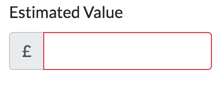
is-invalidon aninput-group, it should give the border to the entire component.This snippet generates something that looks like this:
Applying border to the entire
input-groupwould make it look more consistent with other default input controls, such as file input:I tried on the parent div. In the end, I’ve added the following which does what I want, but my gut says this should work off the shelf:
@aedart If I do that, it tries to fit in the feedback inside the input-group, which breaks the layout
I’m using angular, and I control the visibility of the feedback with that so I don’t care about the nearby element with the
is-invalidclass.This is my solution to add the
d-blockclass and then manually make it always show exactly when I want it to.C’mon. Is this getting fixed properly? It’s been an issue since the beta(s), through two minor releases, and there’s now talk of version 5 when this is still an issue.
@mdo? Can we get a definitive response as to the status of this bug and the Bootstrap’s team to fix it? It’s a tiny bit ridiculous people can’t have error messages show up for inputs unless they’re marked in a particular way (which may not be suitable for all apps).
It did the trick. I am using it in an Angular component , that’s why I don’t specify it further…
Please support is-(in)valid on the form-group element, or just any parent element of the invalid-feedback and. input elements… That would solve most of the issues.
So why’s this issue closed? Apparently, you need a hack (as summarized by @br3nt) to get it working, and the natural usage – just add the
invalid-feedbackafter the input group – does not behave as expected…Just add d-block to invalid-feedback so it shows no matter what.
just add a d-flex, like below and it will show
<div class="input-group"></div><div class="invalid-feedback d-flex" *ngIf="pattern.controls['field'].errors">Why on earth someone decided to do it this way in bootstrap 4? It worked perfectly in bootstrap 3, showing error block by sibling class is a terrible idea, there are tons of cases when error message block is not an input sibling.
^ Yup. The solution here is to simply add
d-blockto theinvalid-feedbackspan.Example (I’m using Laravel Blade):
This new setup doesn’t make sense to me and I have no idea how it passed the alpha.
What this causes, is having to mix our input and error components. Because you can’t have two separate components like INPUT GROUP and ERROR, because your ERROR component has to be rendered inside the input group to show up. That means you have to nest these components, which makes no sense to me, as they are already grouped by the form-group component.
Therefore, .has-error or .is-invalid on the .form-group should automatically show the .invalid-feedback component, no matter where it is in the child structure. Forcing it to be a direct sibling of input makes no sense to me.
The warning state would be welcomed back, too. I used to use it for drawing attention to inputs on edit forms that may have side effects but aren’t errors, i.e. inputting an article title in all-uppercase when it doesn’t need to be, or a warning that changing the name of an account will change that account’s URLs.
Cab we get a proper, official fix for this please?
Here is a use case where the current syntax does not work. What if you have a composite input that is made of multiple inputs and then you want the validation info to appear below all the inputs? For example you might have a password and password-repeat and then want to show the error message underneath both.
We should be able to have both the old way and the new way.
As well, it is nice to be able to show feedback in the success state as well, not just the invalid state.
Edit: it appears that there is an undocumented
valid-feedbackclass. See https://github.com/twbs/bootstrap/issues/24811If you ask me, all solutions above seem hacky - at best. The validation support for forms in Alpha 6 and TWBS 3 was a lot better. We’re now sorta forced to rely on HTML5 input states rather and advanced markup for column model, input grouped input’s.
Eagerly looking forward to a solution, for now I rely on my own CSS skills to make it work, as even examples from the docs don’t support is-invalid properly. 😦
Yeah, whis the hell is this closed? Please reopen this.
This way is not as flexible as bs3 was 😦
I think most of applications will not decide to move validations to js as they are not useful for now without external libs. Also, because server-side validation is required anyway for security reasons, implementing js validations doubles the work to be done.
What if small js plugin will simply add
.has-error/.has-succesclass to closest.form-groupon validation state change? This will keep flexible customization and bring js validations support.Or at least to add a setting similar to
$enable-transitionsto make bs4 work the old way (support.has-errorclass on.form-group).I’m having this issue as well.
As mdo mentioned, It’s impossible to trigger the ‘block’ status with the following markup being that everything is being triggered from the single input state. You have to have an ‘is-invalid’ state that gets added to the parent, as there are not ‘parent’ selectors in css…
Being that I use solely ‘server validation’ as they’re calling it, I need that parent element ‘is-invalid’ hook back?
I was encountering this issue as well, trying to figure out how to get the invalid-feedback to show when the invalid-feedback is not a sibling of the input (i.e input groups, etc.) and using a feedback text for custom file-input is another good example where this new method fails.
I don’t think HTML5 validation is actually ready for the real web yet (not until CSS parent selectors become available, which I think is never).
Once could add in a JavaScript routine to monitor the validity state of an input (or the is-valid/invalid class) and then check for any elements that may have a
forattribute that matches the input’s ID, or via the aria-describedby attribute (which can contain a list of element IDs), and apply the states to those elements.But it feels bad using JavaScript to correct this shortcoming.
Having a 'valid-feedback` element would be nice as well, or at least the ability to change the color of the invalid-feedback to green
It would be at least nice to get the ability to place a class on the input-group, and for radio-groups or stacked check boxes, etc (i.e feedback messages to select one)
Using the latest beta-3, the invalid-feedback does not show up ( as in the beta-2 ) If I add the class=“d-flex” to the invalid-feedback , then it shows up BUT when valid , it does not disappear ( should become display:none )
` <div id="userInputGroup4" role="group" aria-labelledby="userInputGroup4__BV_label_" class="b-form-group form-group"> <label id="userInputGroup4__BV_label_" for="passwordInput" class="col-form-label pt-0">Password:</label>
Is this something to be fixed in the 4.0.0 release or not ( should I trick it ? using standard input in col + button in another col… my current fix… )
@themustafaomar Yes, you can emulate
.invalid-feedbackwith other CSS, but it’s not a great solution for projects using templating to build forms and inputs.February 2019 and still no fix for this… input groups are broken for server-side validation. Bump
adding more weight to this! Server side validation is totally broken in bootstrap4 apart from very very simple examples.
@strongui Completely agree with this. Using sibling selectors is just wholly inflexible and only covers a fraction of use cases. It’s great if you have a simple form and copy the mark-up from the Bootstrap documentation, but a lot of websites have forms more complex than that.
I’m all for using progressive features, but this seems to be a poorly supported and executed approach thus far.
@borriej adding
d-flexas you suggested worked perfectly and fixes thedisplay: nonethat @Konafets mentioned as the cause of the issue. For a permanent fix this will need to be included automatically.Note the border issue that @fjsuarez mentioned is definitely an ugly issue - is there a separate issue for this?
Definitely something to see if we can support. We’re also missing proper support for checks and radios as mentioned in another issue.
Same issue, any official solution? Would not it be better to
.invalid-feedbackbe placed with.form-group?This is really lame. Since when was relying on HTML5 and JS validation good practice?
We really really need an option for server side validation.
I’m using VueJS to apply error messages that are returned from my server, and even with just this simple setup, having any nested Vue components hides Bootstrap 4’s
is-invalidmessages since the error message isn’t a child of the input element.Bootstrap 3’s setup worked great, but this is a mess to workaround.
This needs to be fixed imo.
Hmm, any update on this? Running into this now myself.
Sucks because I nest some input elements inside Vue components, and I can’t apply the
is-invaliderror class to the nested input element since Vue applies it to the rootdivelement.😦
Using the latest beta-3, the invalid-feedback does not show up ( as in the beta-2 ) If I add the class=“d-flex” to the invalid-feedback , then it shows up BUT when valid , it does not disappear ( should become display:none )
` <div id="userInputGroup4" role="group" aria-labelledby="userInputGroup4__BV_label_" class="b-form-group form-group"> <label id="userInputGroup4__BV_label_" for="passwordInput" class="col-form-label pt-0">Password:</label>
Is this something to be fixed in the 4.0.0 release or not ( should I trick it ? )
New take on this coming in #25020. Demo of a new upcoming example featuring input group validation styles is at https://codepen.io/emdeoh/pen/mpewXo (hit the submit button to test). Please share feedback!
damn: logged a question on stackoverflow before finding this issue. maybe the visibility there will create some up-votes for supporting both the
has-*and:invalidfeedback mechanisms. To be honest:validdoesn’t have the flexibility of the old method, and I agree with @tmorehouse on displaying success as well as failure.I’m having the same problem. But since I’m coming from the alpha version and I was using
form-control-feedbackwith custom JS to hide it when needed, I was able to just override the display of theinvalid-feedback:I know this is not ideal, but at least it allowed me to move forward.
To be clear, that’s not a default input control—that’s a hacked up custom form control 😃.
The rounded corners issue can be solved with the border classes too: https://getbootstrap.com/docs/4.0/utilities/borders/ (
rounded-right)@repoles He literally said this in his comment:
FWIW, this issue is quite old and there have been changes to the form validation styles to make things more bulletproof. v4.4 in particular I believe saw some improvements (see #29264). The input groups show invalid feedback: https://codepen.io/emdeoh/pen/PoqBdzN.
That said, our docs show this working for custom styles and server side, but do note that input groups lose their rounded corners. (We have no way of targeting those corners reliably unfortunately.)
F**k it! I’ve just created a new ticket. #29439.
I agree with @stevebauman this is properly broken… and lame. Server side validation css is completely overridden by the local validation, making it effectively useless without hacking the scss.
setting
.is-invalidon the input to indicate a server side error is overridden by local validations.To save others some time from reading the whole thread, it seems that currently, incl. beta2, one possible workaround is to use .flex-wrap and force a width of 100% on the .invalid-feedback element (so it wraps):
Note the w-100 class on the .invalid-feedback element and the .flex-wrap on the input-group element.
@mdo Any plans for upcoming releases to resolve this?
@martinbean : Why not use sass @extend if you really want to use .has*?
Personally I don’t think it makes any difference (other than bc) what those classes are named, but I do think that is-valid makes a lot more sense than .has-success. After all, a form control is-valid, but a form control has-success?
I have the same issue. I can’t use the
invalid-feedbackwithinput-groupproperly.Thought about
order, but that also fubars any hope of styling the rounded corners properly since first and last child or of type don’t work.No chance of extending the classes outside the inputs either right now. My goal is to provide as much validation behavior without any additional JS to toggle classes based on a parent or child.
i ran into this issue as well as i personally use VueJS to i handle all my own showing of validation errors and classes etc. I have built the following quick CSS file that extends the bootstrap 4-beta validation and allows you to do what you did originally in bootstrap 3, I have also added a JSFiddle example link, hope this helps anyone looking to do something similar.
https://github.com/lilpug/bootstrap-4-beta-validation https://jsfiddle.net/lilpug/1m7heqqr/1/
temporary solution is to add these css
this will force the feedback to wrap into the 2nd line, then in your html put feedback below input
You are right, just created the fiddle that shows you point: https://jsfiddle.net/aedart/tLwsztc0/
However, I’m not sure if the authors are going for this or not. But it does seem like a clear “lack” that invalid-feedback’s appearance is entirely controlled by a siblings’ state, …
Yes, you are right. Perhaps a
spancan do the trick.Also, I just realized that you are also setting the
.is-invalidon the parentdiv. I do not think that this has any effect at all. Only elements withform-controlor.custom-selectshould be affected by this.