storybook: [Bug]: storybook 7 ignores Angular default values
Describe the bug
Consider sb@6 story below
export default {
  title: 'Example/Button',
  component: Button,
} as Meta<Button>;

export const Spacing =  (props: Button) =>  ({
  props,
  template: `
    <p>Minimum recommend gap is 1rem</p>
    <div style="display: flex; gap: 1rem;">
      <storybook-button [label]="label" [size]="size" [primary]="primary" (onClick)="onClick($event)"></storybook-button>
      <storybook-button [label]="label" [size]="size" [primary]="primary" (onClick)="onClick($event)"></storybook-button>
    </div>
  `
});
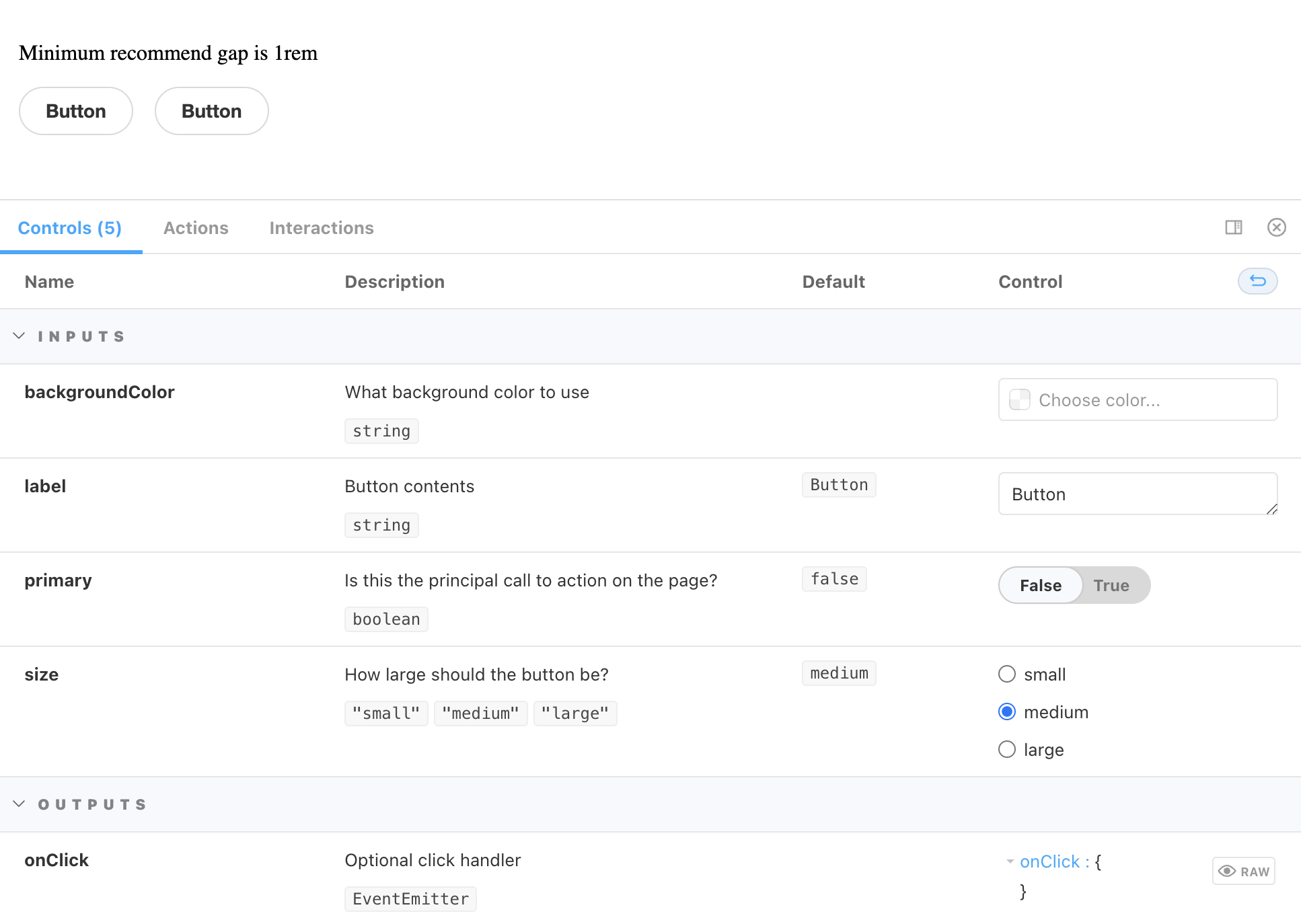
The storybook ui displays buttons with default label and controls with default values applied (label=Button and size=medium)
sb6 screenshot

If this story is translated into sb@7 equivalent,
const meta: Meta<Button> = {
  title: 'Example/Button',
  component: Button,
};
export default meta;

export const Spacing: StoryObj<Button> = {
  render: (props) => ({
      props,
      template: `
        <p>Minimum recommend gap is 1rem</p>
        <div style="display: flex; gap: 1rem;">
          <storybook-button [label]="label" [size]="size" [primary]="primary" (onClick)="onClick($event)"></storybook-button>
          <storybook-button [label]="label" [size]="size" [primary]="primary" (onClick)="onClick($event)"></storybook-button>
        </div>
      `
    })
};
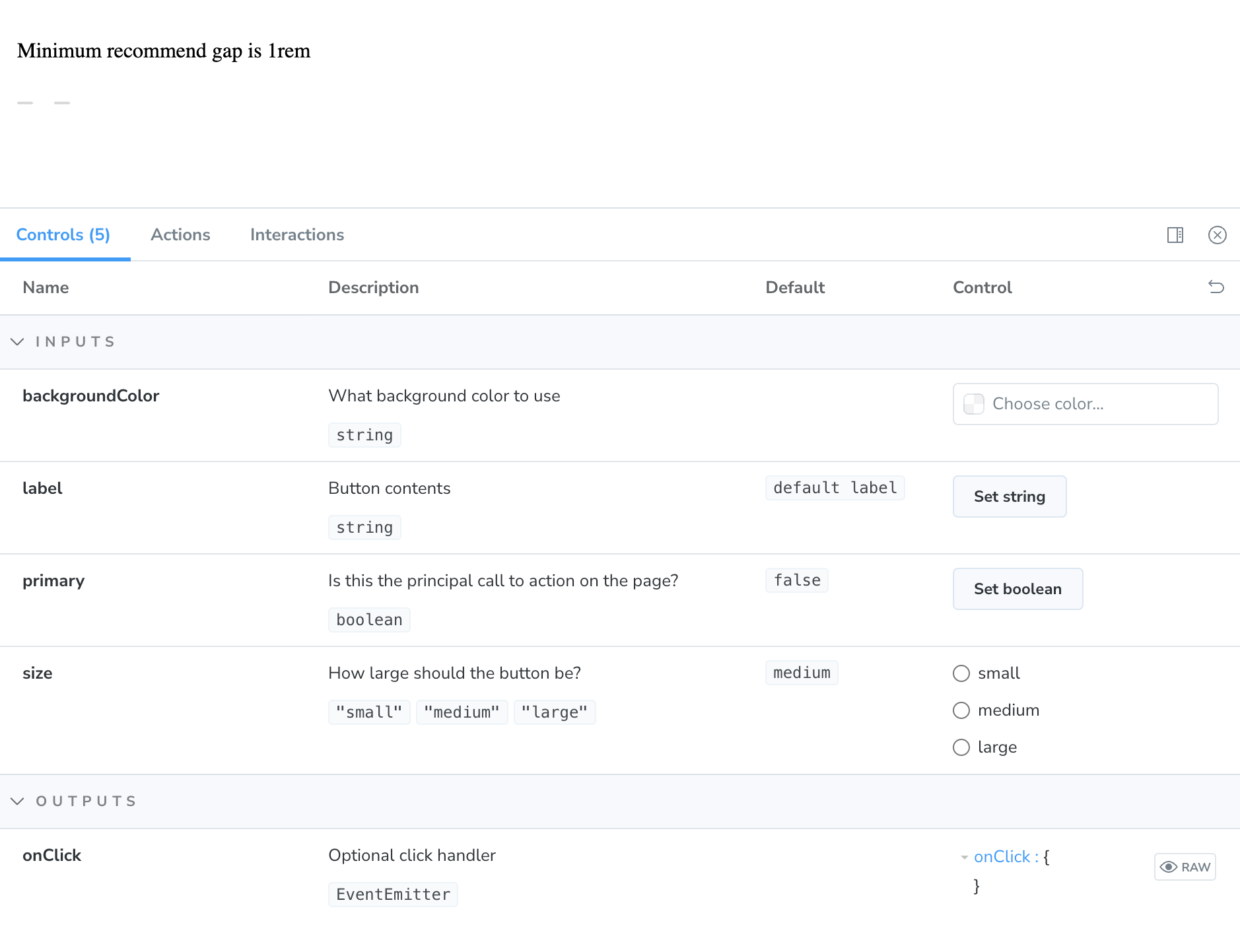
The ui displays buttons with no default values. The control panel also indicates that these default values are not being used (i.e. label=undefined and size=undefined)
sb7 screenshot

Is this difference expected?
- If yes, would you recommend the right way to refactor the story
- If no, is there a plan to port sb6 behavior to sb7?
To Reproduce
System
# Storybook 7
Environment Info:

  System:
    OS: Linux 5.0 undefined
    CPU: (8) x64 Intel(R) Core(TM) i9-9880H CPU @ 2.30GHz
  Binaries:
    Node: 16.14.2 - /usr/local/bin/node
    Yarn: 1.22.19 - /usr/local/bin/yarn
    npm: 7.17.0 - /usr/local/bin/npm
  npmPackages:
    @storybook/addon-essentials: ^7.1.0-alpha.7 => 7.1.0-alpha.7
    @storybook/addon-interactions: ^7.1.0-alpha.7 => 7.1.0-alpha.7
    @storybook/addon-links: ^7.1.0-alpha.7 => 7.1.0-alpha.7
    @storybook/angular: ^7.1.0-alpha.7 => 7.1.0-alpha.7
    @storybook/blocks: ^7.1.0-alpha.7 => 7.1.0-alpha.7
    @storybook/testing-library: ^0.0.14-next.2 => 0.0.14-next.2
Additional context
I was able to get around the issue by using an enhancer.
However, not sure if this is reliable, since I had to dig into Storybook codebase to figure out how to use it.
Moreover, it feels like if Storybook team wanted consumers to use argsEnhancers api, they would document it and probably provide sample enhancers
// .storybook/preview.js
const preview: Preview = {
  argsEnhancers: [
    ({ argTypes }) => {
      const label = argTypes.label.table.defaultValue.summary;
      const size = argTypes.size.table.defaultValue.summary;
      return { label, size };
    }
  ],
  parameters
};
About this issue
- Original URL
- State: closed
- Created a year ago
- Reactions: 1
- Comments: 33 (18 by maintainers)
I like this suggestion as well!
If we want to support these additional two use cases, we could also provide one helper function via a callback argument. Like this:
attr’s signature could be something like this:So we could even define some nice types for
includeandexclude, which would match the arguments types extracted from the component definition.We wouldn’t need to pass
argsadditionally into it since the closure might already be aware of it.@hettiger, @Marklb, @marek-aguita
I have released a snapshot release of this PR: 0.0.0-pr-24434-sha-0d375607
I have introduced a new utility function,
argsToTemplate, designed to assist in generating Angular component templates for Storybook stories. Could you try it out by installing the snapshot version of Storybook for all Storybook packages?The usage is pretty simple:
As a second argument,
argsToTemplateaccepts aninclude/excludeoption for further customization. Would you like to give me some feedback on whether this satisfies your needs?@tmeasday
After talking to @shilman and @ndelangen we have concluded to not provide the utility function via context parameter within the
renderfunction, but instead just provide an exported utility function from@storybook/angular.@tmeasday
@marek-aguita has explained it really well. The new behavior is really dangerous. It totally defeats the confidence that snapshot testing using e.g. chromatic could give you if you heavily rely on default values. That’s because you must ensure that component default values and story default args are in sync at all times. That’s why I’ve created my little workaround. However, I don’t like that I have to do this. I also think, that the old behavior was much better.
This is the CSF-defined
renderfunction right @valentinpalkovic? I agree puttingattrson the context seems like a nice API, I do think there are some technical challenges in getting it on there / typing it right. Maybe we can figure it out though.@tmeasday I was thinking the default values in props was more specific to Angular than it is. So, based on that clarification, I agree that my expectation about the default populating, when clicking the “Set …” button, is wrong.
This looks like a React way of using component and its properties in html but not like in angular! In this scenario i have to add weird ifs everywhere in my stories files? It does not make any sense 😦 For me it is still a regression bug. I can’t use this version of storybook and i have to revert to SB6 because when i have 100+ components and stories for them it is impossible to maintain/change all of these stories. I would like to remind that this feature worked in SB6.
here I’m having a non-template story and the defaults do not work anyway:
@tmeasday If I understand your point correctly, you think the problem there are no default values- is because @miszol1 used custom template, such as <storybook-button [label]=“label”></storybook-button>, in his storybook. The code and screenshot I’ve posted may confirm this is not the reason, since the default values are not set properly even if there is no custom template in the story file.