storybook: Addon background light / dark doesn't work in Docs when using MDX

Describe the bug With 6.1.8 addon background doesn’t work when using Docs + MDX. It does work with DocsPage but doesn’t work when using MDX. With MDX the background color only switch when shifting to Canvas then back to Docs.

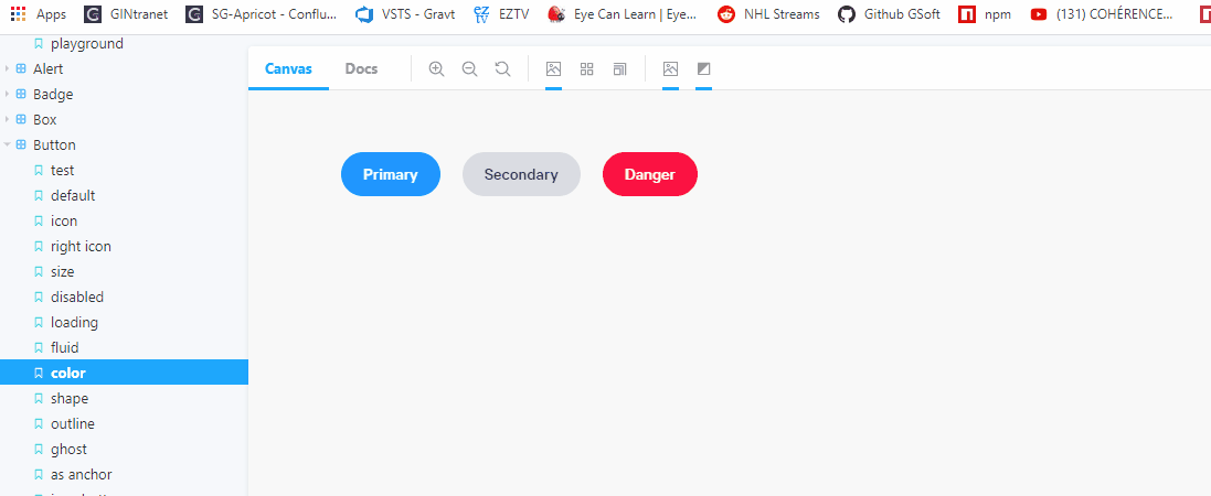
Example of a story definition in MDX that doesn’t work:

<Canvas>
    <Story name="default">
        <Button>Cutoff</Button>
    </Story>
</Canvas>

Video that show the problem:

background_addon

To Reproduce Steps to reproduce the behavior:

  1. Go to ‘…’
  2. Click on ‘…’
  3. Scroll down to ‘…’
  4. See error

Expected behavior A clear and concise description of what you expected to happen.

Screenshots If applicable, add screenshots to help explain your problem.

Code snippets If applicable, add code samples to help explain your problem.

System Please paste the results of npx sb@next info here.

Additional context Add any other context about the problem here.

About this issue

  • Original URL
  • State: open
  • Created 4 years ago
  • Reactions: 9
  • Comments: 27 (16 by maintainers)

Commits related to this issue

Most upvoted comments

Workaround until this is fixed properly:

Beware! this hacks the global CSS scope to target parent elements!

// hack for .mdx backgrounds
addDecorator((story, context) => {
  const defaultBackgroundColorKey = context?.parameters?.backgrounds?.default
  const defaultBackgroundColor = context?.parameters?.backgrounds?.values?.find(v => v.name === defaultBackgroundColorKey)?.value
  const currentBackgroundColor = context?.globals?.backgrounds?.value ?? defaultBackgroundColor

  const styleContent = `.docs-story {
    background-color: ${currentBackgroundColor}
  }`

  return <>
    <style>{styleContent}</style>
    <>{story(context)}</>
  </>
});

I was surprised to find this bug, and even more surprised to find it’s been a known bug for a year and a half.

We want to address this in 6.3. If you want to contribute to Storybook, we’ll prioritize PR review for any fixes here. And if you’d like any help getting started, please jump into the #support channel on our Discord: https://discord.gg/storybook

A workaround for both the background and the grid is to find the ID of the story in the inspector and add it to the canvas element, like <Canvas id="anchor--foundation-color--color">. (No need for the CSS hack mentioned above.)

Same here @tremby cannot believe that if I use mdx all these functionalities are not working. image

With this horrible decorator, inspired in @isc30 decorator I’ve enabled all the options meanwhile an official solution appears 😃

.storybook/preview.js

export const decorators = [
  // https://github.com/storybookjs/storybook/issues/13323#issuecomment-876296801
  // Fix dark theme
  (Story, context) => {
    const defaultBackgroundColorKey = context?.parameters?.backgrounds?.default;
    const grid = context?.parameters?.backgrounds?.grid;
    const defaultBackgroundColor = context?.parameters?.backgrounds?.values?.find(
      (v) => v.name === defaultBackgroundColorKey
    )?.value;
    const currentBackgroundColor = context?.globals?.backgrounds?.value ?? defaultBackgroundColor;

    const gridStyles = context?.globals?.backgrounds?.grid
      ? `
        background-size: 100px 100px, 100px 100px, ${grid.cellSize}px ${grid.cellSize}px, ${grid.cellSize}px ${
          grid.cellSize
        }px !important;
        background-position: ${grid.cellSize}px ${grid.cellSize}px, ${grid.cellSize}px ${grid.cellSize}px, ${
          grid.cellSize
        }px ${grid.cellSize}px, ${grid.cellSize}px ${grid.cellSize}px !important;
        background-blend-mode: difference !important;
        background-image: linear-gradient(rgba(130, 130, 130, ${grid.opacity}) 1px, transparent 1px),
         linear-gradient(90deg, rgba(130, 130, 130, ${grid.opacity}) 1px, transparent 1px),
         linear-gradient(rgba(130, 130, 130, ${grid.opacity / 2}) 1px, transparent 1px),
         linear-gradient(90deg, rgba(130, 130, 130, ${grid.opacity / 2}) 1px, transparent 1px) !important;
         `
      : '';

    const outlineStyles = context?.globals?.outline
      ? `
      .docs-story body {
        outline: 1px solid #2980b9 !important;
      }

      .docs-story article {
        outline: 1px solid #3498db !important;
      }

      .docs-story nav {
        outline: 1px solid #0088c3 !important;
      }

      .docs-story aside {
        outline: 1px solid #33a0ce !important;
      }

      .docs-story section {
        outline: 1px solid #66b8da !important;
      }

      .docs-story header {
        outline: 1px solid #99cfe7 !important;
      }

      .docs-story footer {
        outline: 1px solid #cce7f3 !important;
      }

      .docs-story h1 {
        outline: 1px solid #162544 !important;
      }

      .docs-story h2 {
        outline: 1px solid #314e6e !important;
      }

      .docs-story h3 {
        outline: 1px solid #3e5e85 !important;
      }

      .docs-story h4 {
        outline: 1px solid #449baf !important;
      }

      .docs-story h5 {
        outline: 1px solid #c7d1cb !important;
      }

      .docs-story h6 {
        outline: 1px solid #4371d0 !important;
      }

      .docs-story main {
        outline: 1px solid #2f4f90 !important;
      }

      .docs-story address {
        outline: 1px solid #1a2c51 !important;
      }

      .docs-story div {
        outline: 1px solid #036cdb !important;
      }

      .docs-story p {
        outline: 1px solid #ac050b !important;
      }

      .docs-story hr {
        outline: 1px solid #ff063f !important;
      }

      .docs-story pre {
        outline: 1px solid #850440 !important;
      }

      .docs-story blockquote {
        outline: 1px solid #f1b8e7 !important;
      }

      .docs-story ol {
        outline: 1px solid #ff050c !important;
      }

      .docs-story ul {
        outline: 1px solid #d90416 !important;
      }

      .docs-story li {
        outline: 1px solid #d90416 !important;
      }

      .docs-story dl {
        outline: 1px solid #fd3427 !important;
      }

      .docs-story dt {
        outline: 1px solid #ff0043 !important;
      }

      .docs-story dd {
        outline: 1px solid #e80174 !important;
      }

      .docs-story figure {
        outline: 1px solid #ff00bb !important;
      }

      .docs-story figcaption {
        outline: 1px solid #bf0032 !important;
      }

      .docs-story table {
        outline: 1px solid #00cc99 !important;
      }

      .docs-story caption {
        outline: 1px solid #37ffc4 !important;
      }

      .docs-story thead {
        outline: 1px solid #98daca !important;
      }

      .docs-story tbody {
        outline: 1px solid #64a7a0 !important;
      }

      .docs-story tfoot {
        outline: 1px solid #22746b !important;
      }

      .docs-story tr {
        outline: 1px solid #86c0b2 !important;
      }

      .docs-story th {
        outline: 1px solid #a1e7d6 !important;
      }

      .docs-story td {
        outline: 1px solid #3f5a54 !important;
      }

      .docs-story col {
        outline: 1px solid #6c9a8f !important;
      }

      .docs-story colgroup {
        outline: 1px solid #6c9a9d !important;
      }

      .docs-story button {
        outline: 1px solid #da8301 !important;
      }

      .docs-story datalist {
        outline: 1px solid #c06000 !important;
      }

      .docs-story fieldset {
        outline: 1px solid #d95100 !important;
      }

      .docs-story form {
        outline: 1px solid #d23600 !important;
      }

      .docs-story input {
        outline: 1px solid #fca600 !important;
      }

      .docs-story keygen {
        outline: 1px solid #b31e00 !important;
      }

      .docs-story label {
        outline: 1px solid #ee8900 !important;
      }

      .docs-story legend {
        outline: 1px solid #de6d00 !important;
      }

      .docs-story meter {
        outline: 1px solid #e8630c !important;
      }

      .docs-story optgroup {
        outline: 1px solid #b33600 !important;
      }

      .docs-story option {
        outline: 1px solid #ff8a00 !important;
      }

      .docs-story output {
        outline: 1px solid #ff9619 !important;
      }

      .docs-story progress {
        outline: 1px solid #e57c00 !important;
      }

      .docs-story select {
        outline: 1px solid #e26e0f !important;
      }

      .docs-story textarea {
        outline: 1px solid #cc5400 !important;
      }

      .docs-story details {
        outline: 1px solid #33848f !important;
      }

      .docs-story summary {
        outline: 1px solid #60a1a6 !important;
      }

      .docs-story command {
        outline: 1px solid #438da1 !important;
      }

      .docs-story menu {
        outline: 1px solid #449da6 !important;
      }

      .docs-story del {
        outline: 1px solid #bf0000 !important;
      }

      .docs-story ins {
        outline: 1px solid #400000 !important;
      }

      .docs-story img {
        outline: 1px solid #22746b !important;
      }

      .docs-story iframe {
        outline: 1px solid #64a7a0 !important;
      }

      .docs-story embed {
        outline: 1px solid #98daca !important;
      }

      .docs-story object {
        outline: 1px solid #00cc99 !important;
      }

      .docs-story param {
        outline: 1px solid #37ffc4 !important;
      }

      .docs-story video {
        outline: 1px solid #6ee866 !important;
      }

      .docs-story audio {
        outline: 1px solid #027353 !important;
      }

      .docs-story source {
        outline: 1px solid #012426 !important;
      }

      .docs-story canvas {
        outline: 1px solid #a2f570 !important;
      }

      .docs-story track {
        outline: 1px solid #59a600 !important;
      }

      .docs-story map {
        outline: 1px solid #7be500 !important;
      }

      .docs-story area {
        outline: 1px solid #305900 !important;
      }

      .docs-story a {
        outline: 1px solid #ff62ab !important;
      }

      .docs-story em {
        outline: 1px solid #800b41 !important;
      }

      .docs-story strong {
        outline: 1px solid #ff1583 !important;
      }

      .docs-story i {
        outline: 1px solid #803156 !important;
      }

      .docs-story b {
        outline: 1px solid #cc1169 !important;
      }

      .docs-story u {
        outline: 1px solid #ff0430 !important;
      }

      .docs-story s {
        outline: 1px solid #f805e3 !important;
      }

      .docs-story small {
        outline: 1px solid #d107b2 !important;
      }

      .docs-story abbr {
        outline: 1px solid #4a0263 !important;
      }

      .docs-story q {
        outline: 1px solid #240018 !important;
      }

      .docs-story cite {
        outline: 1px solid #64003c !important;
      }

      .docs-story dfn {
        outline: 1px solid #b4005a !important;
      }

      .docs-story sub {
        outline: 1px solid #dba0c8 !important;
      }

      .docs-story sup {
        outline: 1px solid #cc0256 !important;
      }

      .docs-story time {
        outline: 1px solid #d6606d !important;
      }

      .docs-story code {
        outline: 1px solid #e04251 !important;
      }

      .docs-story kbd {
        outline: 1px solid #5e001f !important;
      }

      .docs-story samp {
        outline: 1px solid #9c0033 !important;
      }

      .docs-story var {
        outline: 1px solid #d90047 !important;
      }

      .docs-story mark {
        outline: 1px solid #ff0053 !important;
      }

      .docs-story bdi {
        outline: 1px solid #bf3668 !important;
      }

      .docs-story bdo {
        outline: 1px solid #6f1400 !important;
      }

      .docs-story ruby {
        outline: 1px solid #ff7b93 !important;
      }

      .docs-story rt {
        outline: 1px solid #ff2f54 !important;
      }

      .docs-story rp {
        outline: 1px solid #803e49 !important;
      }

      .docs-story span {
        outline: 1px solid #cc2643 !important;
      }

      .docs-story br {
        outline: 1px solid #db687d !important;
      }

      .docs-story wbr {
        outline: 1px solid #db175b !important;
      }
      `
      : '';

    const styleContent = `.docs-story {
      background-color: ${currentBackgroundColor};
      ${gridStyles}
    }

    ${outlineStyles}

    `;

    return (
      <>
        <style>{styleContent}</style>
        <>{Story(context)}</>
      </>
    );
  }
];

Just chiming in with a use case I have… We have several styles of buttons, one of which is “white.” It’s more useful to preview that against a dark background. With CSF, I could set the default background to “dark.” Doesn’t work in MDX.

Sorry, I hope I haven’t insult you by saying the feature seems flaky, it wasn’t my intention, I believe this is a great addon. My english is limited and sometimes what I write doesn’t reflect well my intent.

Don’t worry I didn’t read it like that! My English is probably more limited than yours :p

I am not sure how to make this work for MDX other than rendering a container similar to what Anchor is currently doing in DocsPage.

The first thing that comes to my mind would be to drop the per story background feature. I am also not convinced about the probability of users having multiple stories from the same component each with their own set of custom backgrounds.

If you could do a minimal experiment in the repo I might be able to help! I’m a bit busy these days but if you set the motion I can help you out! Feel free to reach me on discord as well