ui: Select options are truncated if they don't fit on the page
If you have lots of options, they get truncated:
<Select>
  <SelectTrigger className="w-[180px]">
    <SelectValue placeholder="Theme" />
  </SelectTrigger>
  <SelectContent>
    {[...Array(100)].map((e, i) => (
      <SelectItem key={i} value={`${i}`}>
        Item number {i}
      </SelectItem>
    ))}
  </SelectContent>
</Select>
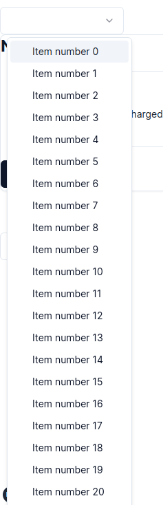
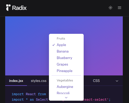
There is no way to scroll the elements, however Radix does scroll them. When there isn’t enough room it adds a vertical scroll thing:
About this issue
- Original URL
- State: closed
- Created 4 years ago
- Reactions: 7
- Comments: 15 (3 by maintainers)
Commits related to this issue
- docs: prevent default browser behaviour with `ctrl-k/j` in `useMagicKeys` (#246) build registry for stackblitz and codesandbox demos — committed to u007/ui by sadeghbarati 3 years ago
You can add the following Tailwind class if position is set to
popperto make it not exceed the viewport height:Not sure if helps, but i managed to solve for myself fixing the height and specifying overflow-y: scroll;
Best solution for now! Cheers!
For me, the solution was to add the proper CSS variable as max height for Content, and add the ScrollUp and ScrollDown buttons around the Viewport.
(classes removed for readability)
I can add scrolling to
<Select />. However I’d recommend checking out https://ui.shadcn.com/docs/components/command#combobox for large sets.Is there gonna be an official fix for this? I don’t know why It hasn’t been done yet especially considering the fact the default select from radix doesn’t have this issue.
It’s easier to understand this way! I wanted to hide the button, so this is what it looks like! Thank you very much!
Just came here to report that. Also, looks like it only happens when
SelectContentpositionprop is equal topopperwhich is the default. Besides that, to make the arrows appear whenpositionis equal toitem-aligned, you need to addSelectPrimitive.ScrollUpButtonandSelectPrimitive.ScrollDownButtonto theSelectContentcomponent.Related: https://github.com/radix-ui/primitives/issues/1980#issuecomment-1479692521