quasar: QSelect dialog on small screens is unintuitive and ambiguous - usability issues
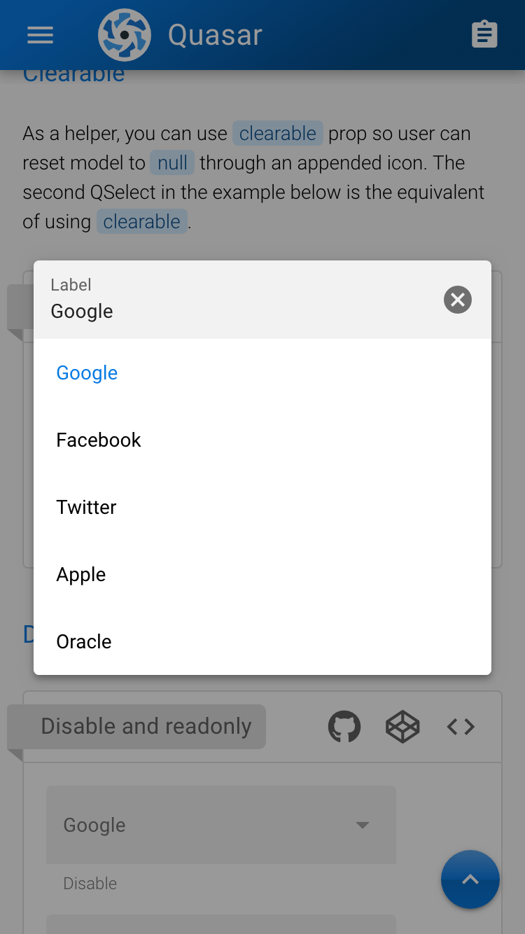
Is your feature request related to a problem? Please describe. On small screens, QSelect displays its picker as a small dialog instead of a dropdown, as shown on the screenshot below (from QSelect test page).
I see two issues here.
First, there is no way to confirm the selection; I know that just the act of selecting a value confirms it and I just need to tap on the black overlay to hide the dialog, but most people doesn’t or will take a while to discover (you can’t beat stupid).
While the dialog closes automatically when selecting a value, using the multiple props keeps it open. This isn’t a real issue with a dropdown, since the black overlay isn’t present behind those.
Furthermore – and this is the second issue – the clearable props shows an “X” button on the field, which exacerbate the first issue, as it gives the impression it will close the dialog, while it will clear the selected data.
Describe the solution you’d like At its minimum, I’d like a “Done” button at the very end, just like any other confirmation dialog.
I would also ditch the “X” button and use an explicit “Clear” button on the bottom left, but I’m open to other solutions.
Describe alternatives you’ve considered While I don’t like the idea of scrolling to center the view on the options, the ability to force the dropdown instead of the dialog would be enough.
Additional context
About this issue
- Original URL
- State: closed
- Created 5 years ago
- Comments: 15 (6 by maintainers)
Commits related to this issue
- feat(QSelect): Add behavior prop to force options list display as menu or dialog ref #4609 — committed to pdanpdan/quasar by pdanpdan 5 years ago
- feat(QSelect): Add behavior prop to force options list display as menu or dialog ref #4609 — committed to pdanpdan/quasar by pdanpdan 5 years ago
- feat(QSelect): Add behavior prop to force options list display as menu or dialog ref #4609 — committed to pdanpdan/quasar by pdanpdan 5 years ago
- feat(QSelect): Add behavior prop to force options list display as menu or dialog ref #4609 — committed to pdanpdan/quasar by pdanpdan 5 years ago
- feat(QSelect): Add behavior prop to force options list display as menu or dialog ref #4609 — committed to pdanpdan/quasar by pdanpdan 5 years ago
- feat(QSelect): Add behavior prop to force options list display as menu or dialog ref #4609 — committed to pdanpdan/quasar by pdanpdan 5 years ago
- feat(QSelect): Add behavior prop to force options list display as menu or dialog ref #4609 — committed to pdanpdan/quasar by pdanpdan 5 years ago
- feat(QSelect): Add behavior prop to force options list display as menu or dialog ref #4609 — committed to pdanpdan/quasar by pdanpdan 5 years ago
- feat(QSelect): Add behavior prop to force options list display as menu or dialog ref #4609 — committed to pdanpdan/quasar by pdanpdan 5 years ago
- feat(QSelect): Add behavior prop to force options list display as menu or dialog ref #4609 — committed to pdanpdan/quasar by pdanpdan 5 years ago
- feat(QSelect): Add behavior prop to force options list display as menu or dialog ref #4609 — committed to pdanpdan/quasar by pdanpdan 5 years ago
- feat(QSelect): Add behavior prop to force options list display as menu or dialog ref #4609 — committed to pdanpdan/quasar by pdanpdan 5 years ago
- feat(QSelect): Add behavior prop to force options list display as menu or dialog ref #4609 — committed to pdanpdan/quasar by pdanpdan 5 years ago
- feat(QSelect): Add behavior prop to force options list display as menu or dialog ref #4609 — committed to pdanpdan/quasar by pdanpdan 5 years ago
- feat(QSelect): Add behavior prop to force options list display as menu or dialog ref #4609 — committed to pdanpdan/quasar by pdanpdan 5 years ago
- feat(QSelect): Add behavior prop to force options list display as menu or dialog ref #4609 — committed to pdanpdan/quasar by pdanpdan 5 years ago
- feat(QSelect): Add behavior prop to force options list display as menu or dialog ref #4609 — committed to pdanpdan/quasar by pdanpdan 5 years ago
- feat(QSelect): Add behavior prop to force options list display as menu or dialog ref #4609 — committed to pdanpdan/quasar by pdanpdan 5 years ago
- feat(QSelect): Add behavior prop to force options list display as menu or dialog ref #4609 — committed to pdanpdan/quasar by pdanpdan 5 years ago
- feat(QSelect): Add behavior prop to force options list display as menu or dialog ref #4609 — committed to pdanpdan/quasar by pdanpdan 5 years ago
New prop will be available in 1.0.6 for QSelect:
behavior.