oppia: Text in navbar overflows in smaller screen size
Describe the bug Text in navbar overflows in smaller screen size
To Reproduce Steps to reproduce the behavior:
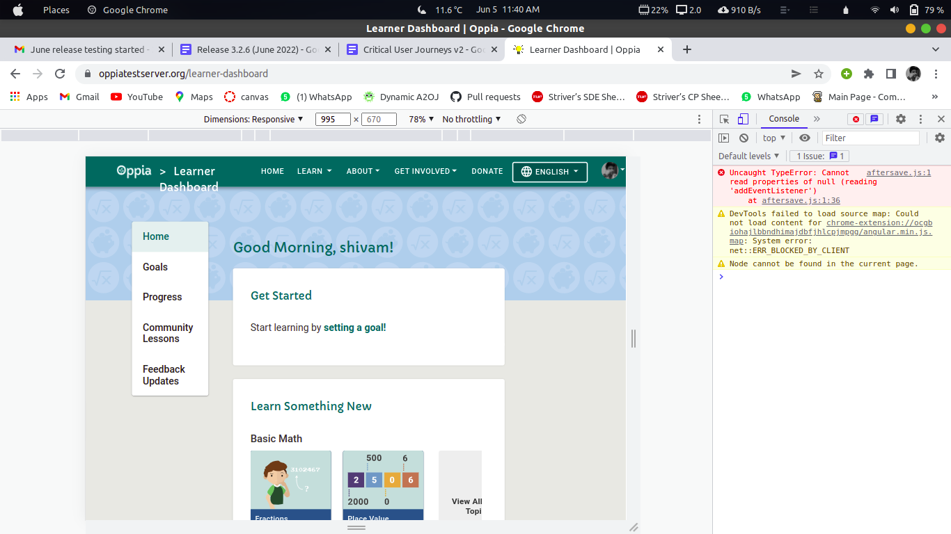
- Go to https://www.oppiatestserver.org/learner-dashboard
- Reduce screen size
- See error
Observed behavior Text in the navbar overflows in smaller screen size
Expected behavior Text in navbar should be aligned
Screenshots / Videos
Possible steps to fix
- Navigate to
core/templates/components/common-layout-directives/navigation-bars/top-navigation-bar.component.html. - Find the code responsible for displaying dashboard information.
- Add appropiate breakpoints to fix the issue.
Desktop (please complete the following information; delete this section if the issue does not arise on desktop):
- OS: Ubuntu 21
- Browser: Chrome
- Browser-version: [e.g. 22]
Smartphone (please complete the following information; delete this section if the issue does not arise on smartphones):
- Device: [e.g. iPhone6]
- OS: [e.g. iOS8.1]
- Browser: [e.g. stock browser, safari]
- Browser-version: [e.g. 22]
Additional context Add any other context about the problem here.
About this issue
- Original URL
- State: closed
- Created 2 years ago
- Comments: 50 (33 by maintainers)
Commits related to this issue
- Fix: #15530 - Fixed the navbar breadcrumb overflow problem. (#17318) Added media query to fix breadcrumb overflow — committed to oppia/oppia by Patel-Muhammad a year ago
I think you should keep the breakpoint (some users have larger screens), but we can also look into ways to shorten the titles if you could provide a list of them here (together with the URLs they map to).
The thing is, when translated, the lengths of titles differ, so we shouldn’t make a unilateral decision based only on the English version. Using breakpoints is more generalizable.