origin-web-console: Application route scoring picks the wrong route
The application route scoring algorithm is too enforcing and makes wrong assumptions about how an application would look like: https://github.com/openshift/origin-web-console/blob/master/app/scripts/services/routes.js#L106
The following is a simple microservices application which consists of three pods each with their own routes. A is the web pod, B and C provide REST APIs:
       +---+
       | A |
       +---+
         |
    +---------+
    |         |
  +-v-+     +-v-+
  | C |     | B |
  +---+     +---+
The new UI picks one of the routes randomly since all three score the same while from the user’s perspective, route A is considered the application route and the entry point to this app.
About this issue
- Original URL
- State: closed
- Created 7 years ago
- Reactions: 1
- Comments: 39 (15 by maintainers)
Everyone agrees on the issues here but all suggestions so far are rejected in favour of a better solution that has not presented itself yet 😃
Here is the summary of suggestions:
If it was to vote, I’d vote for (1) as the least obstructive solution.
hi, just found this issue but it is a pain point we are experiencing as well. we have an application with multiple pods grouped together and 2 of them have routes exposed, but we would like to have our users only use 1 of these routes.
we are currently trying to do some hackery to get it to display our preferred route, but this is non-ideal. i don’t quite follow the problems with letting the user select an annotation for the primary route, but some way to specify this would be greatly appreciated.
It’s not possible to create a scoring that matches the majority of cases since applications look widely different from team to team.
I’d suggest allowing users to label or annotate the main route to hint which one to pick. For example the it could first look for a route with label app-route=true and if not available then score the routes and pick one.
On Fri, 11 Aug 2017 at 22:30, Sam Padgett notifications@github.com wrote:
@spadgett any update on what’s being thought of for this? We’re constantly hitting this with applications that have multiple components that are exposed. For now, we’re removing all those routers from the application, as else, an incorrect route link in the web UI does not help, and you need to either expand the deployment or go through the routes page.
Raising priority since this is clearly problem with the user experience.
There are multiple ways you could have multiple routes:
When there’s multiple routes per service, auto-selection is still tricky. When there’s one per service, and just multiple services, we can probably do something more intelligent.
If you expand the deployment, both routes appear in the “networking” section next to their respective service… I just didn’t realize there were multiple routes, and the URL hoisted out of the collapsed section kept me from digging.
Possible solutions when there’s more than one service:
hit this today with an app that includes two routes, one of which is for API use and one which is for UI use. The incorrect one was displayed.
At minimum, I’d expect an indication there are other routes and way to access the other routes (link, in-place expansion, etc)
Nice to have would be a way to indicate UI-oriented routes, or primary routes that would influence the selection by the console. Annotations don’t seem terrible for that.
@spadgett @openshift-docker I would agree with you if there was an easy way to solve this, but since I don’t find an easier way than annotating the route, I would “at least” consider what it would imply.
This is how we manage source secrets (https://docs.openshift.com/container-platform/3.5/dev_guide/builds/build_inputs.html#automatic-addition-of-a-source-secret-to-a-build-configuration) and it’s still in many other places. I’m not saying the developer should know how to annotate this object, I would encapsulate that in the “oc expose, oc create route commands as well as in the UI, …”
And to your point @spadgett, can I change the overview to group things by other label, e.g: microservice, instead of app? If not, app is a key concept in the UI. Then, even if the app is there an you just use it, it’s really only meaningful to the console (as of now).
Which you can use in a label selector and on the CLI with
-l. And it gets set byoc new-app.My point is the label is not there for overview grouping (unlike the old annotation we had). It’s there for other reasons, and the web console uses it because it’s already set and makes sense.
AFAIK app=appName label is only meaningful to the web console. Everywhere else it’s just a label like any other label, no?
On Fri, Sep 1, 2017 at 6:24 PM, Sam Padgett notifications@github.com wrote:
That’s not a special annotation just for the web console. It’s also set by the CLI and can be used with label selectors. It’s not only for visual grouping.
How do you mean? “List by Application” still exists in origin 3.7-alpha1 and has the same behaviour. It uses “app” label to group the deployment configs and guesses the main route.
Although it doesn’t show the route until expanded, so I guess it’s not the same. But we’ll have the same problem there if a deployment has multiple routes.
We no longer use annotations for grouping.
“List by Resource” on the overview does this, so it’s possible today.
IMHO “expand/collapse” make sense. It allows seeing the other routes and doesn’t take more space at the same time.
However it doesn’t solve the original problem: we have given users a way to group objects into an “application” and but we don’t give them a way to pick the main route. We “force” them to take our guess.
If we let users use annotations to group objects, I don’t see why we shouldn’t use annotations to allow them choose the main route. This of course can be also in UI when editing the routes as a checkbox titled “primary application route” or something similar.
As an alternative we can take the “application” grouping away so that each service can appear separately with its own route.
Seems clear that we need to make all of the routes available somehow in this view since we can’t be sure we’ll correctly guess the primary route. Listing them all seems risky because it could potentially take up a lot of space if there were more than a couple, and you might not care about all of them. Maybe some expand/collapse behavior, e.g. “Show 2 other routes”?
I’m wondering if we should just show all the routes or perhaps a summary if there are multiple. Maybe say “3 Routes” with a popup or click to expand link showing all the routes?
@openshift/team-ux-review
@openshift-docker That’s a good point. If we take a step back, the use-case description would be that as a user, I need to compose an application based on the resources deployed. Regardless of if done via Console or CLI, composing an application consist of choosing the objects that form the application and picking the primary route, if any, for that application.
The confusion and annotation discussion right now is due to the fact that visualization of application is already implemented in the UI without implementing the above use-case.
Special, one-off annotations that only a select group of people know about isn’t going to improve most user’s lives (i.e. it makes some of your demos better, but not substantially). I’d argue we should be looking for representations that makes it easier to realize there are multiple routes, or trying to come up with actual meaningful labels we can put behavior around (in both the UI and CLI and router) to help admins prioritize. If we had router metrics, i’d weight the route with the most traffic. If you’re deploying frequently, I’d weight the route that shows the most frequently updated deployment.
On Thu, Aug 17, 2017 at 12:14 AM, Siamak Sadeghianfar < notifications@github.com> wrote:
Does the “application” concept (set of deployment configs with identical “app” labels) has any effect in the platform other than in the UI?
I’m not sure. That sounds to me like the platform will do something special with the “primary” route. I’m not saying we can’t use an annotation, just pointing out that we should be careful to explain that it’s only for the UI.
@spadgett even if there is an alternate view, I agree with @siamaksade that in this view there needs to be a way to select which route to display. I would think that making it something that the UI would solve visually in the route selection, and making that an annotation is the best way to move forward. Annotations are meant for these type of things, and even though the service relation was confusing it was not because of the annotation but rather to the fact that it didn’t do anything other than visualize services grouped, which is not what you would expect. In this case, I would think that if you have a checkbox marking a route as primary, that would not confuse anybody. Maybe being more explicit in the annotation name and UI feature.
The problem would then be the logic, as to what to do when one selects a route as default, but there’s already another route as default? Worth considering, but in any case, it will most likely still be required to annotate the “objects” for an alternate view to know how to properly display.
I understand. I meant label and annotations as one solution but any solution that would give the control back to the user would be fine 😃
I understand the problem, and I’m not arguing there’s not an issue. We’ll have to think about how to fix.
The proposed solution using labels or annotations also has drawbacks. From experience, I’m hesitant to go ahead with that because we’ve received negative feedback for similar approaches in the past.
@openshift/team-ux-review
This is not really to introduce anything new but rather to fix the new “application” concept introduced in 3.6 based on grouping of the deployment configs with the same “app” label.
User can choose to group resources into the new “application” concept but they have zero control on the route that is visible in the console as the application url:
Take this example: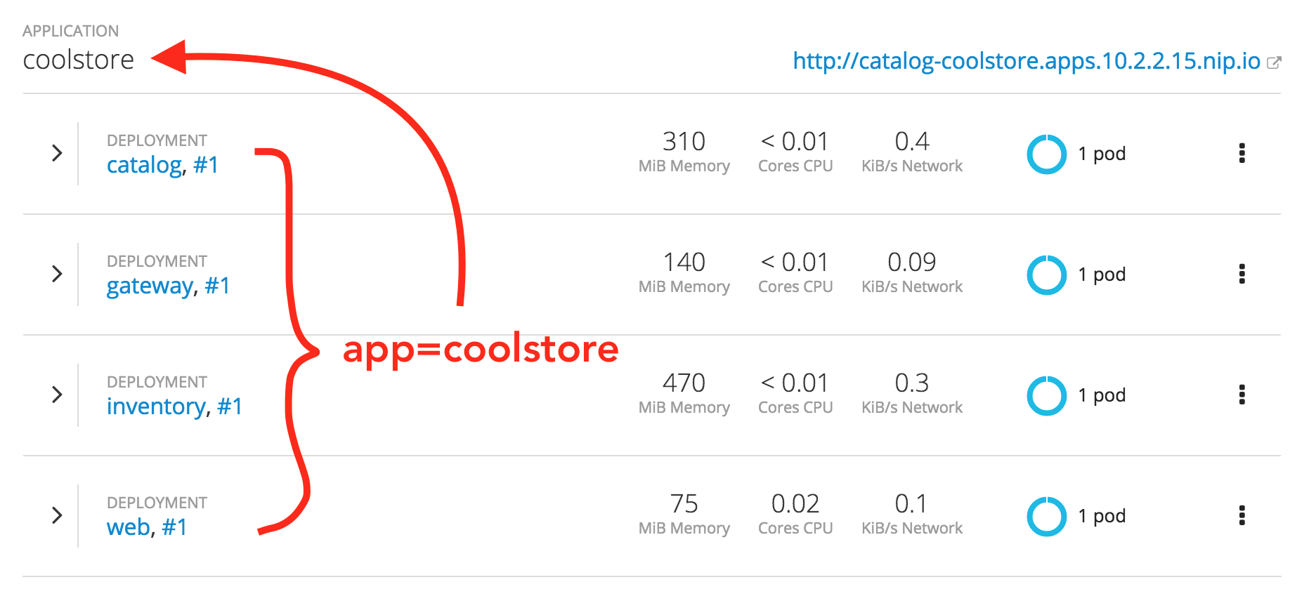
The above is completely misleading because http://catalog-coolstore.host is not the URL to reach this “application” and the user has no way to change that behavior. It’s fine that scoring is a best effort mechanism but not ok that it is forced upon the user.
It’s really meant to be a best effort and not anything definitive. We only have space to show a single route in this view, so rather than picking a random one, we try to use a route with a custom hostname rather than a generated route.
I’m a little hesitant to introduce a label or annotation just for display because that caused confusion in the past. I’m thinking specifically of service grouping. Many users weren’t sure if it changed behavior when it was only used for how we displayed deployments on the overview.
I’m wondering if the real problem is that we need a different view like a topology view or more of a microservices-focused view. We have a card for alternative views.
https://trello.com/c/qklWJUHC
@siamaksade Do you have suggestion for how to improve the scoring, or would you rather be able to pick the route for the app?