neovide: ╱ unicode pattern does not display as well as in the terminal
Describe the bug
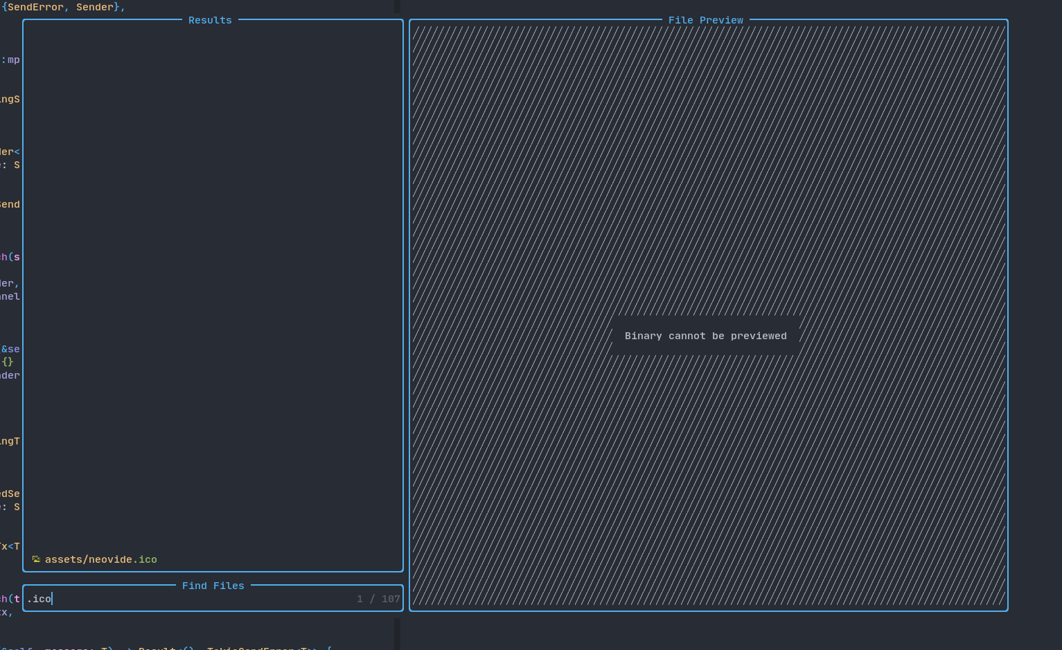
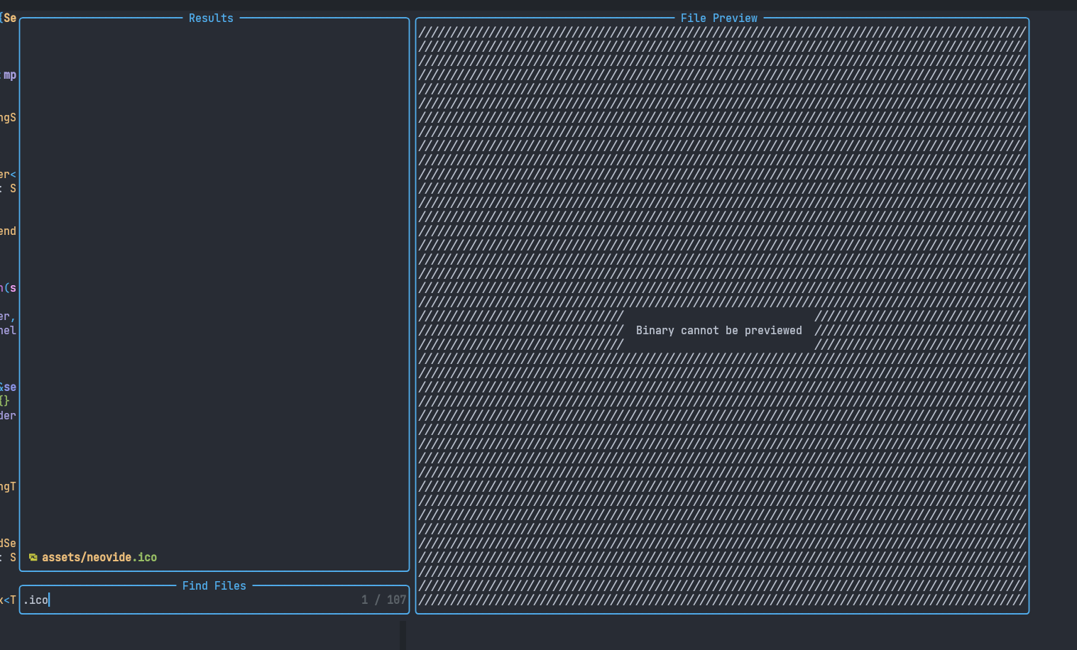
Telescope can use the the unicode ╱ character (note, this is not the ascii /) to achieve an effect that diagonal lines are drawn on the screen. For instance for me, opening telescope to pick a file in the neovide project, and having it preview assets/neovide.ico, causes telescope to use the effect, while displaying the text “Binary cannot be previewed”.
The effect works for me on the terminal, doesn’t work in neovide though, where the symbols don’t line up, at least partly due to vertical space between them.
I also get the issue when using diffs, because I configured this in nvim: set fillchars+=diff:╱. With that setup, deleted lines in diff also make use of that effect.
To Reproduce Steps to reproduce the behavior:
- install telescope
- open neovide, open the neovide source
- launch
:Telescope find_files - preview
assets/neovide.ico - compare display between terminal and neovide
Expected behavior Same rendering in neovide and in neovim terminal.
Screenshots
Desktop (please complete the following information):
- OS: linux, fedora 35
- Neovide 92bc1725f1733547eb0ae25b740425f03f358c2a
- I’m using nerdfonts JetBrains Mono Nerd Fonts 2.2.0-rc from their github page
Please run neovide --log and paste the contents of the .log file here:
output was empty
About this issue
- Original URL
- State: open
- Created 2 years ago
- Comments: 16 (7 by maintainers)
I believe the reason kitty is rendering this character differently, and not using a font fallback, is that it isn’t using any font at all for that character. Like a lot of terminals, it has custom rendering of box drawing characters. You can see the definition for that particular character in the kitty source here
I believe gnome-terminal does the same thing.
JetBrainsMono should have it, or at least mine version does (the left is FiraCode and the right JetBrains Mono)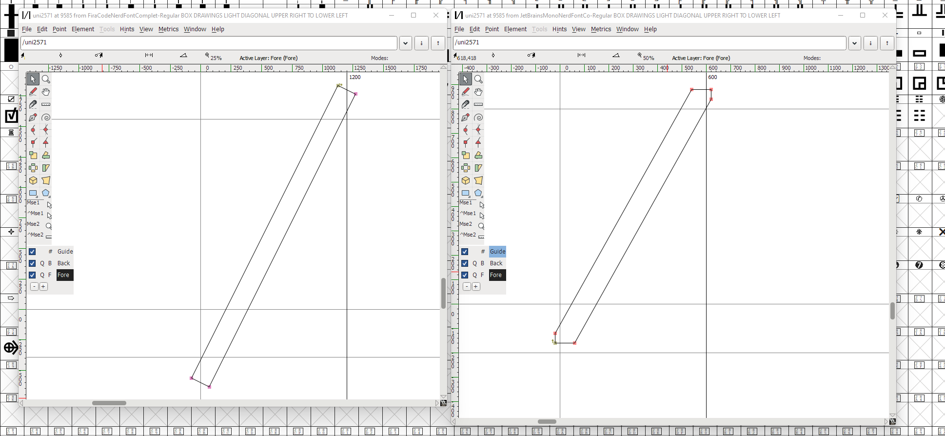
But if you look carefully, the version I have does not extend fully to the bottom, so I think there should be a gap. But I’m on Windows and I have built the font itself based on the latest available JetBrains version 2.242, and the latest Nerd font repository as of a maybe 3 weeks ago. It’s possible that the RC version of Nerdfonts is slightly diffrerent though.
If you want to check, you can install FontForge, and then
View/Gototo go to the right glyph and open it.Edit: I do think that the rendered gap is bigger than it should be according to the font, due to antialiasing effects. Additionally it seems like the FiraCode version further extends the line, probably to attempt to work around that, but for Neovide that does not work, the lines are still antialiased at the ends, causing the very slight visible gap.