vscode: Powerline symbols in the terminal get wrong colors
Does this issue occur when all extensions are disabled?: Yes
- VS Code Version: Version: 1.66.0
- OS Version: macOS Monterey 12.3 (21E230)
Steps to Reproduce:
- Use a powerline-friendly prompt with fancy triangles (
\ue0b0) in the terminal. - Open the terminal.
Expected
How this should look (before 1.66.0)

Actual

The triangles got some mixed colors.
Info
- The prompt works correctly in iTerm, Terminal, etc. (so this is VSCode),
- This fails in all shells in VSCode: bash, zsh, or fish.
- This fails with or without customizations to
workbench.colorCustomizationsliketerminal.ansi*.
About this issue
- Original URL
- State: closed
- Created 2 years ago
- Reactions: 28
- Comments: 27 (10 by maintainers)
Commits related to this issue
- Add missing min contrast change to release notes Part of microsoft/vscode#146406 — committed to microsoft/vscode-docs by Tyriar 2 years ago
- adjust docs for https://github.com/microsoft/vscode/issues/146406 — committed to microsoft/vscode-docs by meganrogge 2 years ago
- adjust docs for https://github.com/microsoft/vscode/issues/146406 — committed to microsoft/vscode-docs by meganrogge 2 years ago
- xterm@4.19.0-beta.23 fixes #146406 — committed to code-oss-dev/code by meganrogge 2 years ago
- fix #146406 — committed to code-oss-dev/code by meganrogge 2 years ago
"terminal.integrated.minimumContrastRatio": 1This feature has been around for a long time but we changed the default in 1.66 as we’re trying to make VS Code the most accessible code editor out there. You can see some of the background on the change here: https://github.com/microsoft/vscode/issues/144411, I know this might cause an inconvenience but the net benefit is quite large:
"terminal.integrated.minimumContrastRatio": 1, you could argue that it’s hard to discover this but it’s equally hard for users where this makes the terminal unusable to discover it for the inverse problem.FYI @isidorn about feedback
@oleq good idea!
@levrik yes it’s because how powerlines works is a bit of a hack; for the triangle character, it inverts the background/foreground color so the shape on the left is the foreground and the negative space on the right is the background.
@jaminthorns I like the idea of excluding at the least the triangle powerline char from minimum contrast ratio 👍, this character will almost always be used to simulate the background color so it’s a nice compromise. This also comes with the nice benefit of still retaining min contrast ratio in the prompt when a powerline is used.
My prompt uses Powerline symbols, so I had this issue after upgrading to 1.66 as well. I think making the terminal accessible by default is a good call, but it also presents a problem for prompts that switch between using the same color for background and foreground to create the illusion of shaped blocks (like Powerline). I’m sure this affects heavily-customized vim and Emacs setups that do similar things, too.
If a user still wanted to have the contrast ratio functionality, it might be nice to have a setting like
terminal.integrated.excludeContrastRatioAdjustmentthat would be a string of characters to exclude from contrast ratio adjustment.@chtenb I stand corrected, it wasn’t mentioned in the release notes. No reason other than we just missed including it. Added it in https://github.com/microsoft/vscode-docs/commit/c4320f6377dcda99fbe72e99f39378114ed5074a, it will be updated when we next publish the website.
Yeah, but IMO 4.5 shouldn’t be the default because suddenly the ansi terminal colors requested aren’t the ones requested. It’s another layer of confusion on top of something already confusing. This change isn’t really a net benefit.
There are two basic types of accessibility that are relevant here:
1 is obviously good, but 2 is a problem if enabled by default. We don’t ship computers with high-contrast mode, large type, and text-to-speech enabled by default, do we? It would be silly.
The way I understand the fix that’s been proposed is that it will make an exception for specific fonts, but it will still modify the colors displayed. This is still bad - you’re making edge cases that have to be maintained, and you’re opening the door for more of those edge cases as people inevitably discover all of the additional places where it breaks.
I’ll further propose that, perhaps, this setting doesn’t really make a lot of sense in the context of a terminal. There’s a very simple solution that doesn’t require these modifications - just add additional themes for the Terminal with an accessible color palette. Simple and it doesn’t introduce edge cases.
I’m glad accessibility is being considered, but I just think this implementation (specifically making it the default) was ill-advised.
TODO:
Not making this a candidate as there’s a workaround, the change is called out in the release notes and the xterm.js update would be more work than it’s worth since the project has had a bunch of changes added since.
The amount of additional work (issues, Twitter replies) this change has brought to maintainers across the globe is not sustainable. I understand the need for accessibility, yet this introduces unwanted side effects for a majority of people. Can we think about how to solve this challenge differently?
Hi, @Tyriar, I’m a theme maker. I have customized various terminal colors in my theme. This feature makes these colors not match my theme anymore…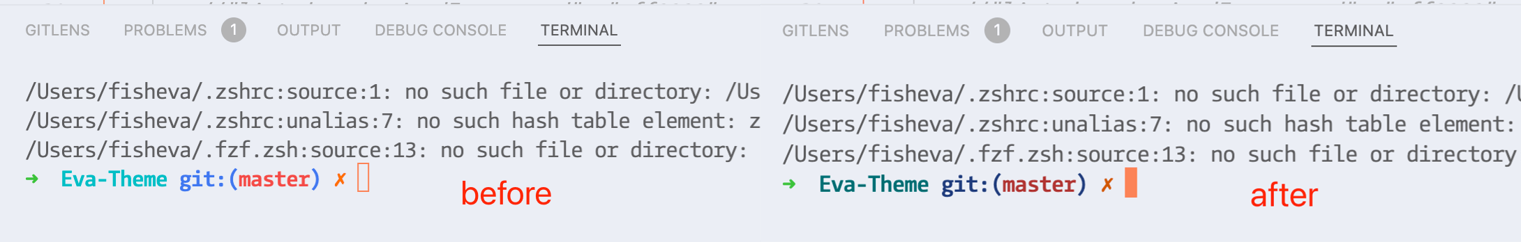
How do I set up in my theme file to make
"terminal.integrated.minimumContrastRatio": 1as the default setting for my theme? Then my theme users don’t have to set it up themselves. I tried to write it in my theme’s JSON file or Package.json, but it doesn’t work.I am looking forward to your solution. Very Thanks!
Why was this not mentioned in the release notes? Control-F on “contrast” or “terminal” don’t find this change.
Thanks. Would love to know why this isn’t the default.
@jstm88 we obviously value accessibility more that you 🤷
This issue is closed with a fix that should work for everyone. If the extra contrast still bothers you you can switch it off by tweaking
terminal.integrated.minimumContrastRatio, I trust that you can set up your computer the way you want 😉@meganrogge awesome work! I’ll validate it in the morning (evening here).
to verify:
terminal.integrated.minimumContrastRatiodoes not alter the color of the powerline glyphs for all values of theterminal.integrated.gpuAccelerationsettingRight now it’s only fixed for
terminal.integrated.gpuAcceleration: canvas. soon will be fixed for dom and webgl as well