slick: Using slick inside of a flexbox element causes slick to grow exponentially
If you initialize a slick carousel inside of a flexbox element, then the slick carousel increases it’s width exponentially. The carousel ends up being extremely wide!
I know that flexbox is not quite ready for production, but Bootstrap 4 is shipping with the option to enable flexbox framework-wide. If this is something easy to fix, then perhaps it would be worthwhile to do so for us early adopters of Bootstrap 4 😃
http://jsfiddle.net/derekfoulk/x3Luhwqm/1/
Steps to reproduce the problem
- Wrap your carousel element with an element
- Set
display: flex;on that element
What is the expected behaviour?
I expected the slick carousel to stay @ 100% width of the flexbox element.
What is observed behaviour?
The slider starts out much wider than the parent (flexbox) element, and continues to grow wider after each iteration of the carousel.
More Details
- I have verified this behavior on current & recent versions of Chrome, Firefox & Edge
- Using slick v1.6.0
- I’m unsure if this has worked as intended with previous versions of slick
About this issue
- Original URL
- State: closed
- Created 8 years ago
- Reactions: 26
- Comments: 32
for flexbox is solved by adding to the parent element { min-width: 0; }
So for me, I only have my flex container set to
display: flex;. Inside there are two elements. Both only have the flex property. One is set toflex: 1;, which is the slider, and one hasflex: 0;. With this setup the issue mentioned above occurred.Solution
For me adding
overflow: hidden;to the slider element (which gets theslick-initialized slick-sliderclasses) fixed the problem. When I disable the property and use the slider, it happens again. When I activate it again, slick recalculates the correct width on the next interaction.Thanks for the info regarding this. I didn’t realize flexbox inherited dims like tables. Our sliders are now looking great after adding
width: 100%;to their container!Here’s the fix for anyone still looking https://github.com/kenwheeler/slick/issues/982#issuecomment-73517458
.slick-slider { width: 100% max-width: 720px // The widest it will go on a responsive website }
Hope this helps
Adding:
flex-direction: column;to container fixed for meAdding
width: 100vw;to a slider parent helped to me.Hey guys, just lost a day to this bug. Could it be added to documentation somewhere?
This fix works for me!
This is still a very big issue for any design that implements flexbox from top element (body).
This doesn’t fix the issue for me - adding a container around it with
width: 100%still makes.slick168000px wide. bxslider doesn’t suffer from the same issue as a point of reference.I’ve been meaning to read the flex spec at some point to learn the ins and outs of whats happening, but long story short, it looks like you need to a defined width somewhere in the parent heirarchy for normal dimention calculations.
Here’s a non-slick example to illustrate what I mean.
Here’s a fork of your fiddle using the same principle.
Hope that helps.
Edit: Looked into it a bit more. I think 3.c here bears on this case. Flexbox items inherit dimensions like tables. demo
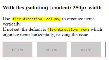
In case it helps someone else, I found out (after 1 day of tests and research) this is a problem with flex and not with Slick. Using
display: flex;setsflex-direction: row;as default, but row is to organize items horizontally and with this Slick can’t find the container’s width. Usingdisplay: flex;and settingflex-direction: column;solves the problem by organizing items vertically, so Slick can now find the container’s width and adapt to it.–Screenshot 01– –Screenshot 02–
 –Screenshot 03–
By the way, I used this Flexbox Playground to do some tests. I find it really useful to play with flex before implementing it 😃
I had similar problem:
Flex container with three children. Two end children were fixed width (nav for slider), center was
flex: 1.Attempting to slickify it blew it up.
Took @alamowo’s suggestion and
overflow: hiddenon the slider container (middle div of my flex container) worked brilliantly.So looking forward to moving away from slick slider soon… 😏
Had the same problem,
align-items: center;was causing the issue.I’ve been annoyed having to add 100% to my flexbox stuff. Now I understand why…
Fixed width/max-width is never a solution! Slick simply can’t handle modern sites anymore with its floats 😞
WTF!!!
@optima-ben I was fixing it through adding overflow:hidden to all of the parent flex containers. Of course that also has some side effects like abosulte positioned elements which overlap do get cropped. But with this i can deal in the future.