site-kit-wp: Module Stats widget charts are inconsistent across modules
Bug Description
Looking at the widget-based versions of “Stats” component charts, I noticed a few inconsistencies across them which we should address.
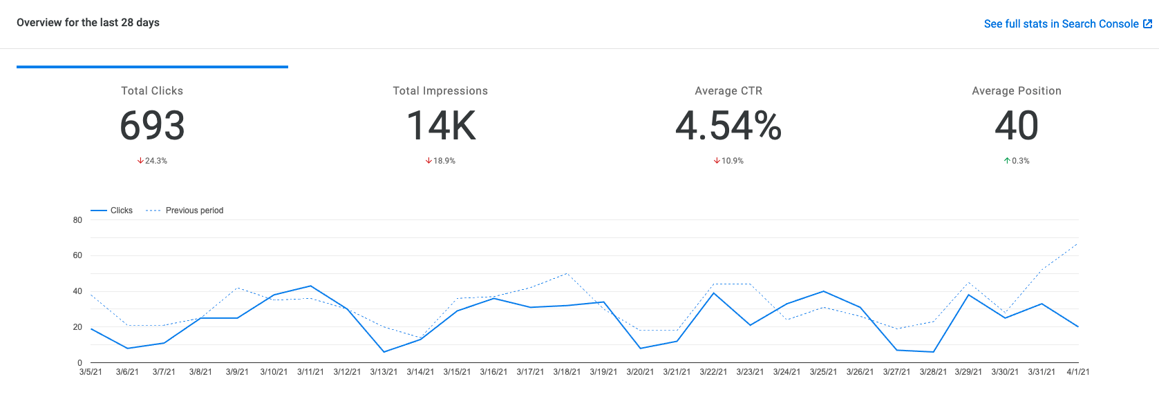
Search Console
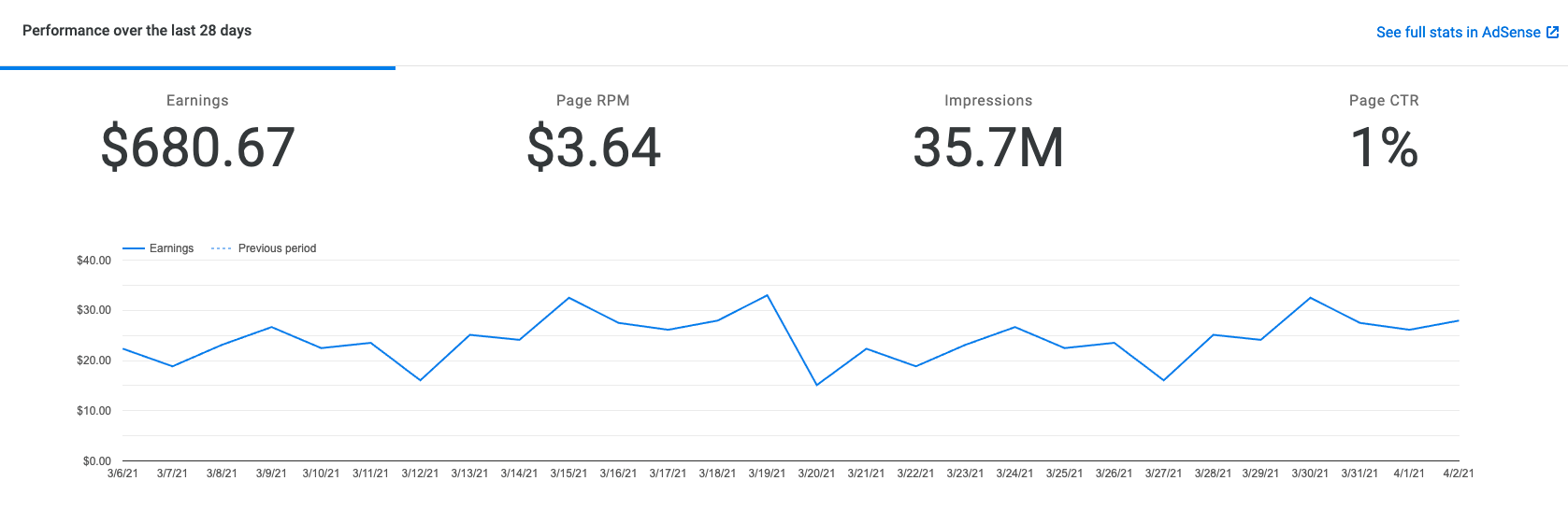
 AdSense
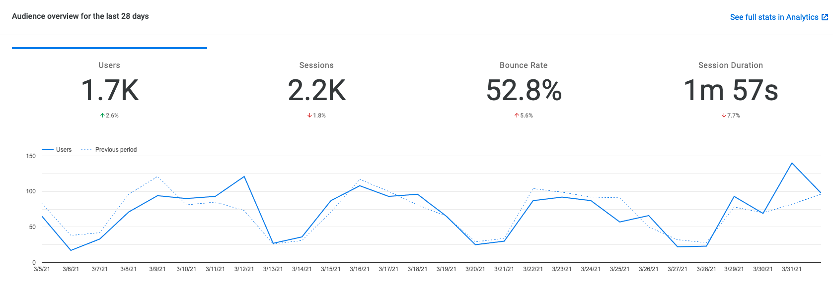
 Analytics
Inconsistencies
Chart Width
- After merging https://github.com/google/site-kit-wp/pull/3078, charts for Search Console and AdSense have consistent dimensions
- The Analytics chart is now the one that stands out as different at this viewport size
- Overall it’s very wide, but also looks like it goes a little too far to the right
- Attention should be paid to how these look in mobile as well which seems to differ (or at least require some customization) to allow for enough space for y-axis labels (for all available choices) in smaller viewports
Overview
- AdSense has no gap/padding around the overview and is flush against the widget header and sides as a result.
This is most obvious by looking at the blue bar
With other issues improving consistency (such as limiting the selected stats to 1) it seems like maybe we can extract a new component or two that all of the module-specific versions use internally to avoid duplication, and the inconsistency that comes with it. If the charts can mostly use the same options, then we should probably use a common component for these parts.
Do not alter or remove anything below. The following sections will be managed by moderators only.
Acceptance criteria
- The graphs on the Search Console, AdSense, and Analytics module pages should be visually aligned (refactored widget-based version only), with the Analytics graph mostly serving as the reference that the other two should be updated to follow. Particularly:
- The AdSense graph should receive the same spacing above the big numbers as Analytics and Search Console have (spacing between the blue “selected” indicator and the widget header).
- The Search Console and AdSense graphs should have no extra spacing around them, they should only have the regular widget body padding the same way that the Analytics graph has, plus consistent spacing needed on the left side only to allow for the y-axis labels.
- All three of these graphs should be adjusted to use smooth lines instead of hard corners, similar to the graph in the new All Traffic widget on the Site Kit dashboard.
Implementation Brief
- update the
.googlesitekit-adsense-performance-overviewin the SASS to have padding of24pxby default and16pxup to960pxviewport width. ($bp-desktop) - edit
assets/js/modules/adsense/components/module/ModuleOverviewWidget/Stats.jsand update thechartAreato have:width: '100%'left: 60
- also update the
curveTypetofunction - edit
assets/js/modules/search-console/components/module/ModuleOverviewWidget/Stats.jsand update thechartAreato have:height: '80%'width: '100%'left: 60
- also update the
curveTypetofunction - edit
assets/js/modules/analytics/components/module/ModuleOverviewWidget/Stats.jsand update thecurveTypetofunction
Test Coverage
- N/A
Visual Regression Changes
- Update visual tests accordingly
QA Brief
- Inspect the overview charts on the Search Console, AdSense, and Analytics module pages, and verify that the ACs have been met.
Changelog entry
- Update charts to use consistent styles between modules.
About this issue
- Original URL
- State: closed
- Created 3 years ago
- Reactions: 1
- Comments: 16 (6 by maintainers)
@Hazlitte @tofumatt I think we should keep this simple for now. We should be able to achieve similar layout using classes and CSS, let’s not do any JS refactoring to use a common component, as that would indeed increase the scope of this issue.
I would advise to more pragmatically stick to the ACs here and not do any component refactoring, i.e. @Hazlitte this issue is or should be only your number 1. The other three would be refactoring that’s potentially worth doing, but not within this issue.
@aaemnnosttv I’ve added ACs here based on the related UX feedback and discussion.