site-kit-wp: Analytics: Inconsistent reporting periods / incorrect dates
Bug Description
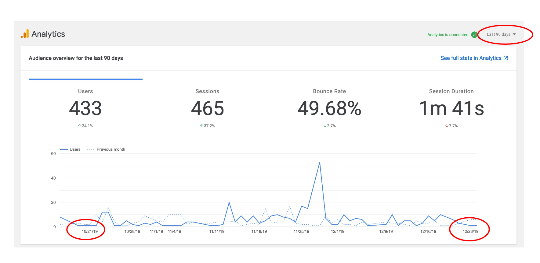
The Analytics dashboard in Site Kit shows inconsistent and possibly incorrect reporting dates based on dropdown selection selection, in particular 90 days reporting period.
Examples below:
From WordPress user Current date is Feb 5th 2020. Below are examples or incorrect reporting periods
Related WordPress support topic https://wordpress.org/support/topic/wrong-date-with-analytics/
Reproduced
- 7 day preview: no issue
- 14 day preview: no issue
- 28 day preview: no issue
- 90 day preview: incorrect reporting periods
Screenshots
Additional Context
Do not alter or remove anything below. The following sections will be managed by moderators only.
Acceptance criteria
- The timeframe displayed in GA report should be within 1-3 days at most of the actual timeframe (i.e. if the user selects “90 days”, the chart should display 87 days the least)
Implementation Brief
- When constructing the Analytics chart in
AnalyticsDashboardWidgetSiteStats, addhAxis.minValueandhAxis.maxValueto the chart options:- In
extractAnalyticsDashboardData- returnminDateandmaxDatevalues.maxDateis the date of the last returned entry. Because the query compares two time periodsminDateis the date of the row that starts the latter half of the rows (lastMonth). - In
AnalyticsDashboardWidgetSiteStats, pass the min/max values to the call tosetOptions:const options = this.setOptions( dataMap.minDate, dataMap.maxDate ); - Adjust
setOptionsto accept min/max values, using them forhAxis.minValueandhAxis.maxValues.
- In
Changelog entry
About this issue
- Original URL
- State: closed
- Created 4 years ago
- Comments: 22 (7 by maintainers)
The type of the value depends on the way you have configured the x- axis (what data type it is set to). In our case, the type here is specified as “date” (https://github.com/google/site-kit-wp/blob/0eacc17f4c2627ad4f7e4ba81d666dbe3058d738/assets/js/modules/analytics/util/index.js#L147) and it is constructed from Date objects (https://github.com/google/site-kit-wp/blob/develop/assets/js/modules/analytics/util/index.js#L82-L84). I tested the code in the IB and observed an improvement of the x-axis labeling. eg, adding:
resulted in the chart showing those dates at the left and right hand end of the x axis (except at very small screen sizes).