react-native-gifted-chat: Multiline does not grow TextInput until several characters into new line

Issue Description

First of all, I’m a big fan of the chat! Thank you to all who have contributed. 🎉

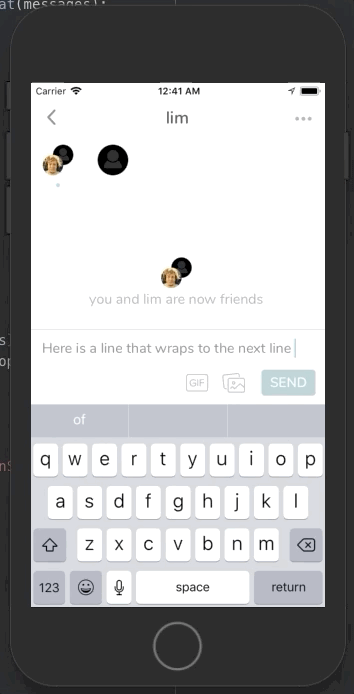
We’re seeing an issue where the TextInput does not grow vertically until several characters into the new line (see attached gif). So, it’ll grow to two lines on, say, the 5th character after the wrap. Same with the third line, fourth line, etc. After a few characters, the TextInput does grow to show the line.

Steps to Reproduce / Code Snippets

Repro Steps:

  1. Type until the end of the first line.
  2. Type 1-3 characters into the second line, so that the text wraps. See the TextInput has not yet grown.
  3. Type a few more characters. See that TextInput grows to show the second line.
      <GiftedChat
        alignTop
        renderSend={() => null}
        renderAccessory={({ text, onSend }) => (
          <MessengerInputButtons
            sendButton={sendButton}
            onSend={onSend}
            text={text}
            showMediaPrompt={this.props.showMediaPrompt}
          />
        )}
        renderBubble={(props) => <ChatBubble {...props} />}
        messages={formattedMessages}
        renderMessageText={(props) => <MessageText {...props} />}
        renderMessageImage={(props) => <MessageImage {...props} />}
        renderTime={() => null}
        renderDay={(props) => <ChatTimeStamp {...props} />}
        renderAvatar={(msgs) => (
          <FailedMessage
            showRetryActionSheet={this.props.showRetryActionSheet}
            messages={msgs}
          />
        )}
        showUserAvatar
        placeholder={'Write a message...'}
        placeholderTextColor={colors.brightGrey}
        textInputStyle={styles.textInputStyle}
        renderInputToolbar={(props) => (
          <InputToolbar
            {...props}
            containerStyle={styles.inputContainerStyle}
          />
        )}
        onSend={sendButton ? () => {} : message => this._onSend(message)}
        minInputToolbarHeight={this.determineMinInputHeight()}
        keyboardShouldPersistTaps={'never'}
        imageStyle={{ margin: 0 }}
        user={{ _id: this.props.user.id }}
        textInputProps={{
          selectionColor: colors.seafoam,
          marginTop: 12,
          marginLeft: 0,
          marginBottom: interfaceHelper.styleSwitch({
            xphone: 21, iphone: 6, android: 6,
          }),
          marginRight: 0,
          paddingTop: 0,
        }}
      />

Expected Results

When text wrapped, we expect the TextInput to grow on the first new character of the new line, not on the, say, 5th or 6th character of the new line.

Additional Information

Apr-08-2020 00-41-50

  • Nodejs version: v8.11.4
  • React version: 16.4.1
  • React Native version: 0.56.0
  • react-native-gifted-chat version: 0.13.0
  • Platform(s) (iOS, Android, or both?): iOS

About this issue

  • Original URL
  • State: closed
  • Created 4 years ago
  • Reactions: 17
  • Comments: 31 (12 by maintainers)

Most upvoted comments

This was not an easy one. It took me a lot of work to find and fix the issue too + animate the input nicely. You simple can’t use padding for your input, it will break the multi-line calculation (thats why you have this glitch)

Since I really wanted a round input + be flexible with animation, I ended up providing my own InputToolbar and I copied the <Composer> from gifted chat and reworked it, rendering my own <Composer>.

The roudness and padding comes from my <View> (and not from the Input) with border and all that padding around it, too. The input is a dead simple input without any borders or padding. But now, setting lineHeight and fontSize won’t break the calculation, since the input has no padding 😃

I won’t give any support on this, but here is my custom Composer, which you can add as custom prop to <GiftedChat>. Play with it until it fits your needs.

It will prob. not work right away for you and you need to know that I use the UIManager for the animation, which have to be activated for android. (its already in the code) In my case, it works butter smooth on iOS and very good on low end Android devices (also butter smooth on high end devices).

If you don’t want that smooth nice animation, delete that parts and just have a look how I fixed the issue.

Here is a video of my input: https://streamable.com/qedbpb

TL;DR: dont add padding to your input, add the padding you need to a wrapping view.

import PropTypes from "prop-types";
import React from "react";
import { View, Platform, StyleSheet, TextInput, LayoutAnimation, UIManager } from "react-native";
import { MIN_COMPOSER_HEIGHT, DEFAULT_PLACEHOLDER } from "react-native-gifted-chat/lib/Constant";
import Color from "react-native-gifted-chat/lib/Color";
const styles = StyleSheet.create({
  textInput: {
    flex: undefined,
    lineHeight: 22,
    paddingTop: 0,
    paddingBottom: 0,
    paddingLeft: 0,
    borderRadius: 0,
    borderWidth: 0,
    backgroundColor: "transparent",
    borderColor: "transparent",
    paddingRight: 0,
    margin: 0,
    marginLeft: 0,
    marginTop: 0,
    marginRight: 0,
    marginBottom: 0,
    minHeight: 55,
    height: 106,
    maxHeight: 106,
    textAlignVertical: "top",
    width: "100%",
    justifyContent: "flex-start",
    alignItems: "flex-start",
    fontSize: 16,
  },
});
const CustomLayoutSpring = {
  duration: 200,
  create: {
    type: LayoutAnimation.Types.easeOut,
    property: LayoutAnimation.Properties.opacity,
    springDamping: 0.7,
  },
  update: {
    type: LayoutAnimation.Types.easeOut,
    springDamping: 0.7,
  },
  delete: {
    type: LayoutAnimation.Types.easeOut,
    property: LayoutAnimation.Properties.opacity,
    springDamping: 0.7,
  },
};
export default class Composer extends React.PureComponent {
  state = {
    finalInputHeight: 0,
  };

  inputRef = React.createRef();

  constructor() {
    super(...arguments);
    if (Platform.OS === "android") {
      UIManager.setLayoutAnimationEnabledExperimental &&
        UIManager.setLayoutAnimationEnabledExperimental(true);
    }

    this.contentSize = undefined;
    this.onContentSizeChange = (e) => {
      const { contentSize } = e.nativeEvent;
      // Support earlier versions of React Native on Android.
      if (!contentSize) {
        return;
      }
      if (
        !this.contentSize ||
        (this.contentSize && this.contentSize.height !== contentSize.height)
      ) {
        this.contentSize = contentSize;
        if (!this.props.text.length) {
          LayoutAnimation.configureNext(CustomLayoutSpring);
          this.setState({ finalInputHeight: 0 });
          this.props.onInputSizeChanged({ width: 0, height: 0 });
        } else {
          this.calcInputHeight();
          this.props.onInputSizeChanged(this.contentSize);
        }
      }
    };
    this.onChangeText = (text) => {
      if (text.length < 2) {
        LayoutAnimation.configureNext(CustomLayoutSpring);
      }
      this.props.onTextChanged(text);
    };
    this.calcInputHeight = () => {
      if (this.contentSize && this.contentSize.height) {
        if (!this.props.text.length && this.state?.finalInputHeight > 0) {
          LayoutAnimation.configureNext(CustomLayoutSpring);
          this.setState({
            finalInputHeight: 0,
          });
          return;
        }
        let height = this.contentSize.height;
        LayoutAnimation.configureNext(CustomLayoutSpring);
        this.setState({
          finalInputHeight: height + 14,
        });
      }
    };
  }
  render() {
    return (
      <View
        style={{
          flex: 1,
          position: "relative",
          justifyContent: "flex-start",
          borderRadius: 20,
          overflow: "hidden",
          backgroundColor: "#f5f5f5",
          marginLeft: 10,
          marginRight: 10,
          paddingTop: 6,
          paddingBottom: 0,
          paddingLeft: 12,
          paddingRight: 12,
          borderWidth: 0.5,
          borderColor: "#b7cc23",
          marginTop: this.state.finalInputHeight > 44 ? 3 : 6,
          minHeight: 38,
          maxHeight: 118,
          height: this.state.finalInputHeight,
        }}
      >
        <TextInput
          testID={this.props.placeholder}
          accessible
          accessibilityLabel={this.props.placeholder}
          placeholder={this.props.placeholder}
          placeholderTextColor={this.props.placeholderTextColor}
          multiline={this.props.multiline}
          editable={!this.props.disableComposer}
          onContentSizeChange={this.onContentSizeChange}
          onChangeText={this.onChangeText}
          textBreakStrategy="highQuality"
          style={styles.textInput}
          autoFocus={this.props.textInputAutoFocus}
          value={this.props.text}
          autoCompleteType="off"
          enablesReturnKeyAutomatically
          underlineColorAndroid="transparent"
          keyboardAppearance={this.props.keyboardAppearance}
          {...this.props.textInputProps}
          ref={this.inputRef}
        />
      </View>
    );
  }
}
Composer.defaultProps = {
  composerHeight: MIN_COMPOSER_HEIGHT,
  text: "",
  placeholderTextColor: Color.defaultColor,
  placeholder: DEFAULT_PLACEHOLDER,
  textInputProps: null,
  multiline: true,
  disableComposer: false,
  textInputStyle: {},
  textInputAutoFocus: false,
  keyboardAppearance: "default",
  onTextChanged: () => {},
  onInputSizeChanged: () => {},
};
Composer.propTypes = {
  composerHeight: PropTypes.number,
  text: PropTypes.string,
  placeholder: PropTypes.string,
  placeholderTextColor: PropTypes.string,
  textInputProps: PropTypes.object,
  onTextChanged: PropTypes.func,
  onInputSizeChanged: PropTypes.func,
  multiline: PropTypes.bool,
  disableComposer: PropTypes.bool,
  textInputStyle: PropTypes.any,
  textInputAutoFocus: PropTypes.bool,
  keyboardAppearance: PropTypes.string,
};

@izakfilmalter functional component version 😉

really god job @Hirbod

import React, {FC, useState, useRef} from 'react';
import {
  StyleSheet,
  View,
  LayoutAnimation,
  TextInput,
  UIManager,
} from 'react-native';
import {DEFAULT_PLACEHOLDER} from 'react-native-gifted-chat/lib/Constant';
import {ComposerProps} from 'react-native-gifted-chat';

import {isAndroid} from '../../utils/constants';
import {COLORS} from '../../utils/styles';

interface ContentSize {
  width: number;
  height: number;
}

type NativeElement = {
  nativeEvent: {
    contentSize: ContentSize;
  };
};

const CustomLayoutSpring = {
  duration: 200,
  create: {
    type: LayoutAnimation.Types.easeOut,
    property: LayoutAnimation.Properties.opacity,
    springDamping: 0.7,
  },
  update: {
    type: LayoutAnimation.Types.easeOut,
    springDamping: 0.7,
  },
  delete: {
    type: LayoutAnimation.Types.easeOut,
    property: LayoutAnimation.Properties.opacity,
    springDamping: 0.7,
  },
};

const ChatComposer: FC<ComposerProps> = ({
  text = '',
  placeholder = DEFAULT_PLACEHOLDER,
  placeholderTextColor,
  textInputProps,
  onTextChanged,
  onInputSizeChanged,
  multiline = true,
  disableComposer = false,
  textInputAutoFocus,
  keyboardAppearance,
}) => {
  if (isAndroid) {
    UIManager.setLayoutAnimationEnabledExperimental &&
      UIManager.setLayoutAnimationEnabledExperimental(true);
  }
  const inputRef: any = useRef(null);
  const [newContentSize, setNewContentSize] = useState<
    ContentSize | undefined
  >();
  const [finalInputHeight, setFinalInputHeight] = useState(28);

  const calcInputHeight = (contentSize: ContentSize) => {
    if (contentSize?.height) {
      if (!text?.length && finalInputHeight) {
        LayoutAnimation.configureNext(CustomLayoutSpring);
        setFinalInputHeight(0);

        return;
      }
      LayoutAnimation.configureNext(CustomLayoutSpring);
      setFinalInputHeight(contentSize.height + 14);
    }
  };

  const onContentSizeChange = ({nativeEvent: {contentSize}}: NativeElement) => {
    if (!contentSize) {
      return;
    }
    if (
      !newContentSize ||
      (newContentSize && newContentSize.height !== contentSize.height)
    ) {
      setNewContentSize(contentSize);
      if (!text?.length && onInputSizeChanged) {
        LayoutAnimation.configureNext(CustomLayoutSpring);
        setFinalInputHeight(0);
        onInputSizeChanged({width: 0, height: 0});
      } else if (onInputSizeChanged) {
        calcInputHeight(contentSize);
        onInputSizeChanged(contentSize);
      }
    }
  };

  const onChangeText = (text: string) => {
    if (text.length < 2) {
      LayoutAnimation.configureNext(CustomLayoutSpring);
    }
    onTextChanged && onTextChanged(text);
  };

  return (
    <View
      style={[
        styles.composer,
        {marginTop: finalInputHeight > 44 ? 3 : 6, height: finalInputHeight},
      ]}>
      <TextInput
        ref={inputRef}
        testID={placeholder}
        accessible
        accessibilityLabel={placeholder}
        placeholder={placeholder}
        placeholderTextColor={placeholderTextColor}
        multiline={multiline}
        editable={!disableComposer}
        onContentSizeChange={onContentSizeChange}
        onChangeText={onChangeText}
        textBreakStrategy="highQuality"
        style={styles.textInput}
        autoFocus={textInputAutoFocus}
        value={text}
        autoCompleteType="off"
        enablesReturnKeyAutomatically
        underlineColorAndroid="transparent"
        keyboardAppearance={keyboardAppearance}
        {...textInputProps}
      />
    </View>
  );
};

const styles = StyleSheet.create({
  composer: {
    flex: 1,
    position: 'relative',
    justifyContent: 'flex-start',
    borderRadius: 20,
    overflow: 'hidden',
    backgroundColor: '#f5f5f5',
    marginLeft: 10,
    marginRight: 10,
    paddingTop: 6,
    paddingBottom: 0,
    paddingLeft: 12,
    paddingRight: 12,
    borderWidth: 0.5,
    borderColor: '#b7cc23',
    minHeight: 38,
    maxHeight: 118,
  },
  textInput: {
    flex: undefined,
    lineHeight: 22,
    paddingTop: 0,
    paddingBottom: 0,
    paddingLeft: 0,
    borderRadius: 0,
    borderWidth: 0,
    backgroundColor: 'transparent',
    borderColor: 'transparent',
    paddingRight: 0,
    margin: 0,
    marginLeft: 0,
    marginTop: 0,
    marginRight: 0,
    marginBottom: 0,
    minHeight: 55,
    height: 106,
    maxHeight: 106,
    textAlignVertical: 'top',
    width: '100%',
    justifyContent: 'flex-start',
    alignItems: 'flex-start',
    fontSize: 16,
  },

export default ChatComposer;

There are many factors to keep in mind @newkolay. This are some props which kick into the calculation (remember, they are all suited to my layout and app and might differ from yours and need to be adjusted)

bottomOffset={this.isIphoneX() ? 22 : -12}
minComposerHeight={28}
maxComposerHeight={106}
minInputToolbarHeight={50}
renderInputToolbar={this.renderInputToolbar.bind(this)}
renderComposer={this.renderComposer}

I also have a custom renderInputToolbar prop. These paddings kick in too.

  renderInputToolbar(props) {
    //Add the extra styles via containerStyle
    return (
      <InputToolbar
        {...props}
        containerStyle={{
          backgroundColor: this.props.theme.colors.surface,
          paddingTop: 6,
          paddingBottom: 12,
          borderTopColor: this.props.theme.colors.disabled,
        }}
      />
    );
  }

And think to pass the composer right

  renderComposer(props) {
    // where composer is my first post
    return <Composer {...props} />;
  }

Fit those parameters to your need. I am currently rewriting my Chat to functional components and will do a big cleanup and repost my new effort in couple of weeks but for now it should be understandable. Make sure to also install the newest version since it has some toolbar fixes wich I’ve send a PR for.

I also think that a single iPhoneX check might not be enough since there are also android devices with a notch. I will change that to use safe-area insets once I’m done refactoring.

For everyone else, you can try the following, though not sure if it’ll break anything else that might rely on a fixed height.

import { GiftedChat, Composer } from "react-native-gifted-chat";

<GiftedChat
  renderComposer={(props) => {
     // Force composerHeight to be auto to allow its height to grow, make sure its after the props spread
     return <Composer {...props} composerHeight="auto" />; 
}} />

@newkolay ok I fixed it: Change the onContentSizeChange function with this here. Thanks for reporting, since it was also bugged in my App 😄

    this.onContentSizeChange = (e) => {
      const { contentSize } = e.nativeEvent;
      // Support earlier versions of React Native on Android.
      if (!contentSize) {
        return;
      }
      if (
        !this.contentSize ||
        (this.contentSize && this.contentSize.height !== contentSize.height)
      ) {
        this.contentSize = contentSize;
        if (!this.props.text.length) {
          LayoutAnimation.configureNext(CustomLayoutSpring);
          this.setState({ finalInputHeight: 0 });
          this.props.onInputSizeChanged({ width: 0, height: 0 });
        } else {
          this.calcInputHeight();
          this.props.onInputSizeChanged(this.contentSize);
        }
      }
    };

I also updated my original post

I’m testing with a fixed value of 22, as you pointed. It’s not happening anymore. I’m going to test it and if it’s good, I let you know.

UPDATE

@Hirbod, it’s not happening anymore. I’m using a hook from react-native-safe-area-view-context to get the precisely value for the bottom inset.

Thanks!

Any news on this? Still happening. Thanks!

I noticed that this is happening because of setting a custom padding in textInputStyle of the Composer.

<GiftedChat
          alwaysShowSend
          renderInputToolbar={(props) => (
            <InputToolbar
              {...props}
              renderSend={this.renderSend}
              primaryStyle={{ borderRadius: 10 }}
              renderComposer={(props1) => (
                <Composer
                  {...props1}
                  textInputStyle={{
                    textAlignVertical: 'top',
                    backgroundColor: 'red',
                    overflow: 'hidden',
                    borderRadius: 10,
                    padding: 10 <------ THIS IS THE PROBLEM
                  }}
                />
              )}
            />
          )}
        />

@Johan-dutoit I believe the problem is being caused by this line: https://github.com/FaridSafi/react-native-gifted-chat/blame/d40c3bb011c4b8e303f7fda18fd7afd2bdbd695e/src/Composer.tsx#L106 which by default sets the height of the composer to a fixed height of 200. When I comment out that line, then it starts working again.

I switched to getstream. This lib is dead.

On Thu, Feb 24, 2022 at 9:57 AM Hirbod @.***> wrote:

I abandoned this project and switched over to https://github.com/flyerhq/react-native-chat-ui, which also has superb input accessory support

— Reply to this email directly, view it on GitHub https://github.com/FaridSafi/react-native-gifted-chat/issues/1727#issuecomment-1050113008, or unsubscribe https://github.com/notifications/unsubscribe-auth/ABM2FGTB4ZSDSNTR6DNR6GDU4ZWRPANCNFSM4MDW4OTA . Triage notifications on the go with GitHub Mobile for iOS https://apps.apple.com/app/apple-store/id1477376905?ct=notification-email&mt=8&pt=524675 or Android https://play.google.com/store/apps/details?id=com.github.android&referrer=utm_campaign%3Dnotification-email%26utm_medium%3Demail%26utm_source%3Dgithub.

You are receiving this because you were mentioned.Message ID: @.***>

– Izak

I abandoned this project and switched over to https://github.com/flyerhq/react-native-chat-ui, which also has superb input accessory support

@izakfilmalter unfortunately not. The chat is the last thing in my app I haven’t refactored yet.

This issue has been automatically marked as stale because it has not had recent activity. It will be closed if no further activity occurs. Thank you for your contributions.

This issue has been automatically marked as stale because it has not had recent activity. It will be closed if no further activity occurs. Thank you for your contributions.