App: [HOLD for payment 2022-01-25] Create Expensify branded generic error page
If you haven’t already, check out our contributing guidelines for onboarding and email contributors@expensify.com to request to join our Slack channel!
Coming from https://github.com/Expensify/App/pull/6478 – following a good suggestion from @zoontek.
Action Performed:
No specific action – just any action that causes an uncaught JS exception caught by our ErrorBoundary. Of course, we never want to land here, because it’s a sign that our app isn’t working as it’s supposed to. But over the lifetime of this app it’s a near-inevitability that we’ll introduce a few bugs that get caught by our error boundary. Right now, we just display a blank white screen.
Expected Result:
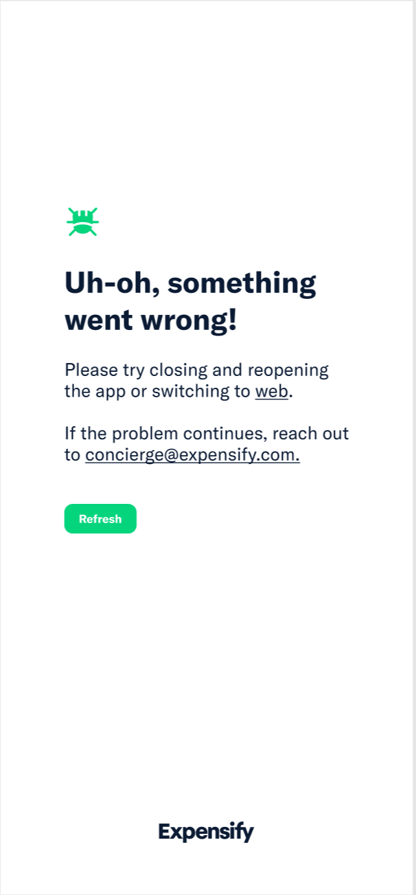
Instead of rendering a blank white screen, we should display an Expensify-branded generic error screen.
Mockup
Copy
Title
Uh-oh, something went wrong!
Body (iOS/Android)
Please try closing and reopening the app or switching to web.
If the problem persists, reach out to concierge@expensify.com.
Body (web/mWeb/desktop)
If the problem persists, reach out to concierge@expensify.com.
Button text
Should say Reload, not Refresh
Actual Result:
We show a blank white screen.
Workaround:
n/a
Platform:
Where is this issue occurring?
- Web
- iOS
- Android
- Desktop App
- Mobile Web
Version Number: Reproducible in staging?: Reproducible in production?: Logs: https://stackoverflow.com/c/expensify/questions/4856 Notes/Photos/Videos: Any additional supporting documentation Expensify/Expensify Issue URL: Issue reported by: @zoontek here Slack conversation:
About this issue
- Original URL
- State: closed
- Created 3 years ago
- Reactions: 1
- Comments: 73 (41 by maintainers)
@kidroca and I were discussing in this Slack thread that it would be good to give the user an escape route when they effectively get “stuck” in the error boundary https://expensify.slack.com/archives/C01GTK53T8Q/p1640218046497900
To summarize: Even with a “refresh” the user might have some bad data in Onyx and won’t be able to recover without taking one of the following actions:
The conclusion we came to is that it would be good to also display an additional “sign out” button when we detect that a user is “caught in a loop” that they can’t escape.
How does everyone feel about that?
And if everyone agrees can we get a mockup for how the error boundary page might look with a “sign out” option?
As most of the changes require designing and styling, I don’t expect their part of the proposal.
@mananjadhav If you don’t have any more questions, then I am good with your proposal. Steps are clearly laid out.
cc: @roryabraham
🎀 👀 🎀
I actually wonder if it should be more concise? I feel like giving them 3 different routes to pursue may be a bit confusing as to what is best next steps. I feel like concierge makes the most sense to mention. Also, should we include a way to get off the page, like a back or home button?
I’m thinking something like this?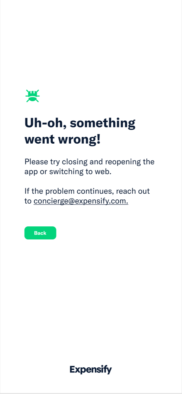
That’s correct. Thanks, @Christinadobrzyn.
Ah so sorry @parasharrajat! Let me reopen the job and hire you for it!
Okay, glad that easier issue makes up for it.
There’s more context in the Slack thread on how we might do it. It might be fine to keep the implementation simple and show the Sign Out button immediately. A user would most likely try to “Refresh” first and then “Sign Out” if they land on the page again. The important thing seems to be that they have some kind of escape hatch.
I think adding a
Sign outbutton is a good call@marcaaron suggestion looks good. Yup, I think better hold the PR.
Sweet, I just hired you 👍🏽
No
Homepage
Yes, good point. I’ll ask for translations.
Guessing we’ll make it external soon.
Proposal
ErrorVieworAppErrorViewBaseErrorBoundaryrender the componentQuick questions:
webhyperlink will take us to homepage or some specific page?@laurenreidexpensify This has been cleaned up and is ready for export.
Cool @roryabraham can you clean up the O/P with the new proposed solution and hide all the outdated comments, so it’s easier for a contributor to parse? once that’s done I’ll add this to Upwork 👍🏽
@laurenreidexpensify I’ve got context here so I’m assigning myself as the CME 🙂
ok we could swap in our larger button for web
okie! web I think can be virtually the same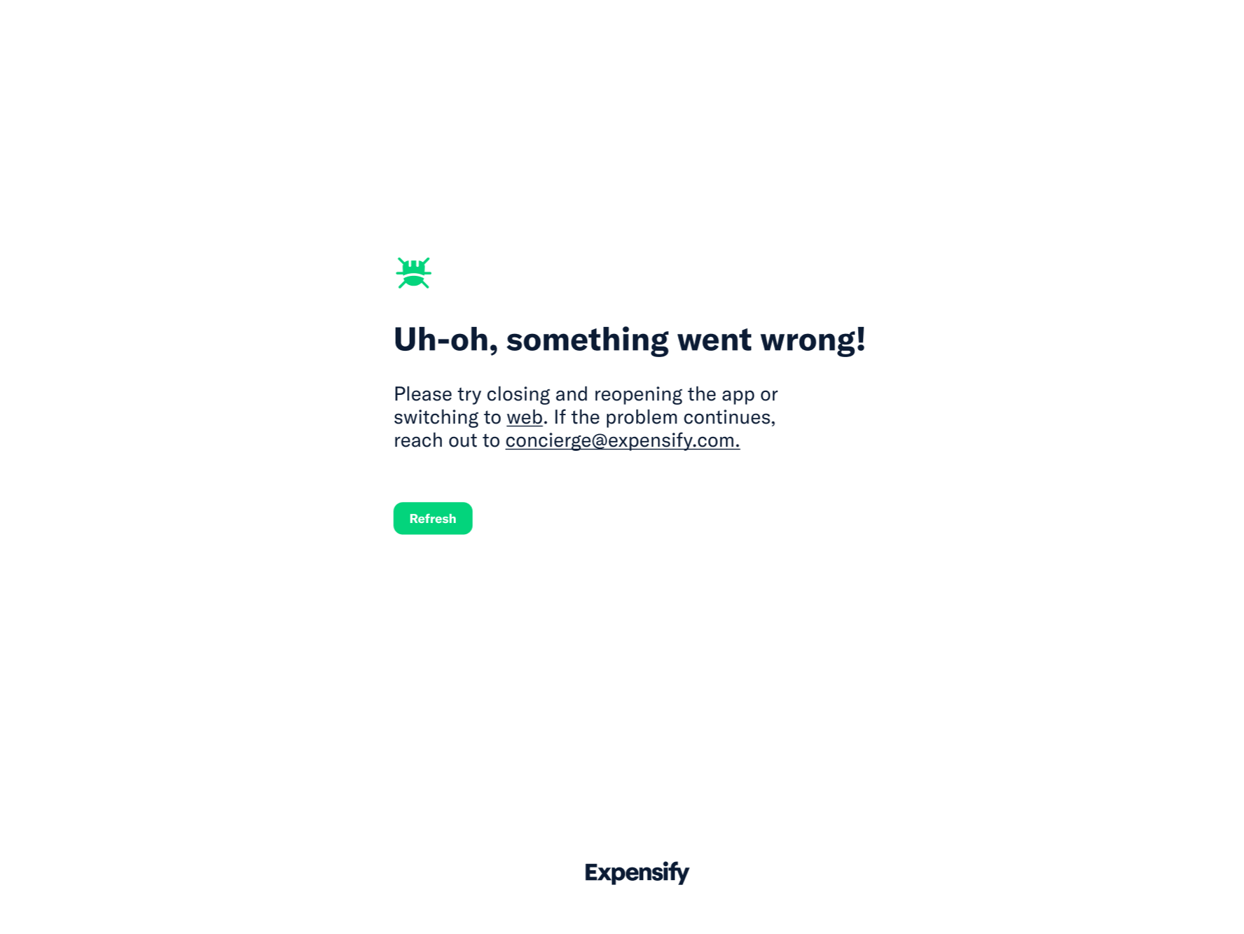
How about something like this:
Mobile app copy:
Uh-oh, something went wrong! Please try closing and reopening the app. If that doesn’t work try using our website. If you need support, email us at concierge@expensify.com, check out our customer community, or schedule a call with one of our Guides.
Web copy:
Uh-oh, something went wrong! If you need support, email us at concierge@expensify.com, check out our customer community, or schedule a call with one of our Guides.
We can hyperlink “Guides” to one of the existing request a call modals, perhaps the one from UseDot. Thoughts? @roryabraham @megankelso.
Okay @rosegrech let’s include the following information:
So something like this might be a rough draft (which you can tweak and improve as you see fit):
I think we need some clarity on what information this copy may need to include. If it’s just a 404 page, I think something like the above is fine.
Regardless, would love to work with marketing on ideas! Just wrote these for mockups.
@roryabraham and whomever might be assigned as the CM, I added @zoontek as “Reported by:” in the OP because I think they should be compensated $250 for reporting this here, once this issue has been fixed internally or externally
I’ve been approaching this as essentially a 404 page but @roryabraham let me know if I’m mistaken? Depending on what errors will land you here probably affects what kind of links/copy we should include.
On the design side, I’ve been a bit stumped. I agree that this is a great opportunity for a little brand moment but it feels like we have no branding to insert here, at least not visually. We could play with our colors for perhaps a two color design but New Expensify is so minimal and light that something colorful would probably feel too dissimilar compared to the other screens.
Here’s what I played around with just to see.
I think the best options for now is come up with some clever copy for a simple screen like on the left? cc @Expensify/marketing for ideas!