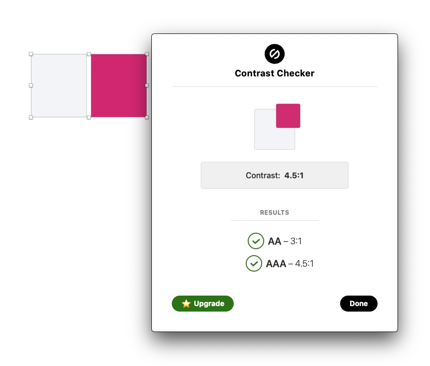
carbon: Contrast ratio insufficient for some color combinations
According to the Color Guidelines:
If the difference between two values is 50 or greater, the colors are accessible. Anything below a difference of 50 may fail accessibility standards.
However, there are multiple colors that do not meet this criteria (expected ratio: 4.5), e.g.:
magenta-60(#e5f6ff) andcyan-10(#d12771):4.471
Here’s the full list:
cool-gray-10 / magenta-60 (4.498217550836486)
cyan-10 / magenta-60 (4.4714999480018385)
cyan-10 / warm-gray-60 (4.479357949030447)
green-10 / magenta-60 (4.492613562183291)
magenta-10 / magenta-60 (4.49537081238271)
purple-10 / magenta-60 (4.496385732743474)
warm-gray-10 / magenta-60 (4.494925931674778)
Here’s a script I wrote to check the contrast ratio for all colors.
About this issue
- Original URL
- State: closed
- Created 4 years ago
- Comments: 25 (12 by maintainers)
Just following back up on this issue after having a broad discussion with @dudley-ibm who will be handling the changes across all the files that are hosted in the downloadable color package available here: https://github.com/carbon-design-system/carbon/raw/master/packages/colors/artifacts/IBM_Colors.zip
Those contents are as follows:
After considering the breaking change point that @tw15egan mentioned above, we’re leaning towards naming this “v2.1” to better reflect the insignificant nature of the changes vs. “V03”. Additionally, we’re moving towards dropping the numeral “0” from the naming structure in favor of more traditional versioning, hence “v2.1”.
If there are no objections we can start work on this soon. @jeanservaas we’ll need to update the Carbon color package as well. I think it’s just a .json file that needs editing.
Once everything is live and direct, we’ll want to coordinate our announcements across the appropriate channels.
cc @mjabbink @shixiedesign
V3 makes sense in this context of color palette. Clean and simple to your point. To use 2.1 is logical but unnecessary when compared to v3.
@darekkay the reason it affects so many is because this is the core IBM brand color palette and not just a simple update to the hex values in Carbon. The entire palette will need to be updated to a new version and redistributed in multiple formats to every practitioner working with color across IBM, including partner agencies, updating multiple design kits, brand guidelines, websites, etc. This requires comms across many different channels.
We can go through the process even though I suspect the specific color combinations with Magenta 60 being used in a situation requiring 4.5 WCAG compliance for small text contrast in UI would never happen. At least in a completely hypothetical world it will be fool proof and we can make sure it passes any scripts or various calculation methods should the use case ever arise.
I’ll create two new hex values and report back here with the findings. – Magenta 60 – Cyan 10
FYI @aagonzales @mjabbink @shixiedesign @jeanservaas
Interesting, I think there’s a few things happening here. We did our best to cross-reference every possible permutation for accessibility when fine tuning the palette but it seems a couple may have slipped through the cracks. It also seems that different tools apply slightly different algorithms and rounding profiles.
My guess is that the sketch plugin that we used for contrast analysis rounds up from 3 decimal places, in other words anything with a ratio of 4.495 or higher will yield a result of 4.50. See example with Cool Gray 10 / Magenta 60.
The resolution on the custom script in use by @darekkay has many decimal places of resolution. That being said, it does look like a few slipped through the cracks in the process.
A microscopic adjustment to make Magenta 60 a hair darker would fix everything in the full list outlined above along with a similar adjustment to make Cyan 10 a hair lighter.
cool-gray-10 / magenta-60 (4.498217550836486) cyan-10 / magenta-60 (4.4714999480018385) cyan-10 / warm-gray-60 (4.479357949030447) green-10 / magenta-60 (4.492613562183291) magenta-10 / magenta-60 (4.49537081238271) purple-10 / magenta-60 (4.496385732743474) warm-gray-10 / magenta-60 (4.494925931674778)
My only question / concern is with the knock-on effect of issuing an entirely new palette update which affects every business unit, set of brand guidelines, communications that would need to go out, etc… It’s a pretty massive undertaking believe it or not. And we’d be doing this explicitly for 4.5 text accessibility at the second or third decimal place of resolution for pretty wild combinations mostly involving Magenta which isn’t even a part of our theming in the first place.
Just trying to think it all though. 🧐
@darekkay @aagonzales @shixiedesign
Hey @darekkay thanks or doing the checking and I wish we had your code to help us when we were doing the color work.
I noticed a lot of the values in your list was 4.495+ something… Those colors, when I double checked in Sketch using Stark plugin, shows up as exactly 4.5:1. So these could be real short comings, and I’ll let Carbon team decide if these should be fixed…
The other pairs you caught, could be worth a fix. Sadek and I might have missed them. This can be fixed by tweaking
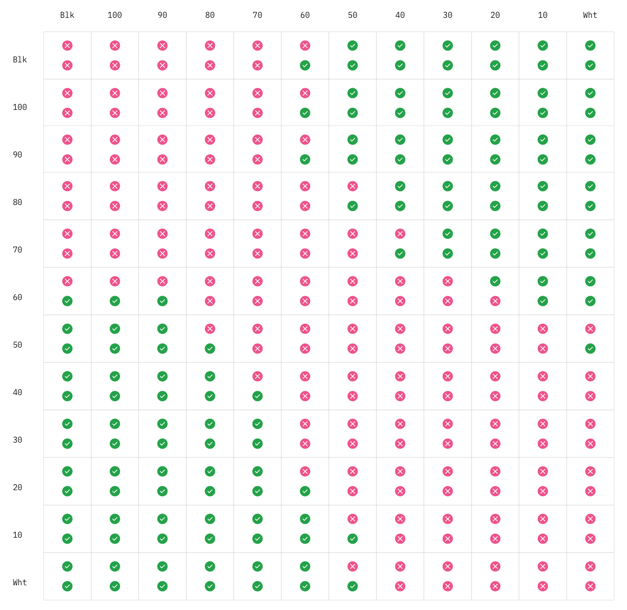
cyan-10ormagenta-60.Here’s the expected contrast ratio of this palette (bottom circle is 3:1, top circle 4.5:1)
@tw15egan and @sadekbazaraa here is the updated IBM Color files (v2.1) as previously discussed. IBM_Colors.zip
@sadekbazaraa Yes, the new values are fine 🙂
Upon further study, an adjustment to Warm Gray 60 vs. Cyan 10 has less of a knock-on effect across the board, so I’ve applied the update there instead.
To the eye, there’s no discernible distinction between the two colors but mathematically it should pass all scripts regardless of the calculations and rounding methods being used.
I’m proposing a title change from v2 to v2.1 since this is such an imperceptible update. The change from v1 to v2 was much more significant by comparison. Alternatively, since future palette updates are highly unlikely for many months, if not years, to come, we could just go to v3 to keep it clean and simple. Thoughts? @mjabbink
@darekkay do you mind updating the script with the new values just to quadruple check?
Revised: – Magenta 60: #d02670 – Warm Gray 60: #726e6e
FYI @shixiedesign @aagonzales @jeanservaas
We need to make the adjustments to the palette. It will require the painful process to update but ultimately must be done.
Are these errors with
white-0a wording problem? I believewhite-0text should never be used on any color value under 60