bootstrap-vue: Bug: Form Feedback does not work correctly if you use an Input Group
I am trying to setup a login form that has an input group and a validation error message.
NOTE: If you understand pictures better, I have included one below to explain this.
After looking thru the documentation I see that if I wrap a < b-form-input > inside of a < b-input-group > I can accomplish the Bootstrap Input Group. I did and it works as expected.
Now I would like to make use of < b-form-feedback >. This is where my problem (which I suspect is a bug happens).
(1) The < b-form-feedback > never displays my error message if I place it just after the closing </ b-input-group >.
(2) If I place it inside the < b-input-group > it displays, but totally messes up the styling.
Please help!

About this issue
- Original URL
- State: closed
- Created 7 years ago
- Comments: 17 (10 by maintainers)
Yep,
I just tested it and it is working.

This is a well know documented bug/feature/limitation with Bootstrap V4 CSS (see several other duplicate issues).
Unfortunately it is not something we can control since it is governed by Bootstraps CSS, and how their new validation feedback works (based on sibling selectors and native browser validation)
Please give your voice/concerns over at twbs/bootstrap: https://github.com/twbs/bootstrap/issues/23454
That would be excellent if you could do that. You could also just create a PR on one of the docs pages, or just create an issue with some sample code we can copy/paste.
i.e.
Will show the invalid feedback even though it is not a sibling of the input.
And produces the following result: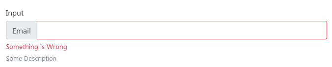
You can appl;y a state to teh b-form-group (we have special CSS for that case), which will display the built feedback specified via the feedback
prop, which works only for hte so-called “server-validation”.We place an
is-invalid(oris-valid) class on the form-group, and then use a child selector to display the form-feedback. You sill need to set the state on the input as well to color it.