backstage: 🐛 Bug Report: [Search] UI not responsive for mobile/xs-sized screens
📜 Description
When searching on mobile devices the UI looks broken. The problem are the filters as there are text overflows & they won’t wrap. sm screens tend to have issues as well
👍 Expected behavior
- The filter section would either wrap to to a full width (
xs={12}) on mobile devices or disappear/ get’s hidden in an accordion - On
smscreen it might be helpfull to look at thespanelements conatining the lifecycle and addellipsison them smth. like the following

👎 Actual Behavior with Screenshots
sm |
xs |
|---|---|
 |
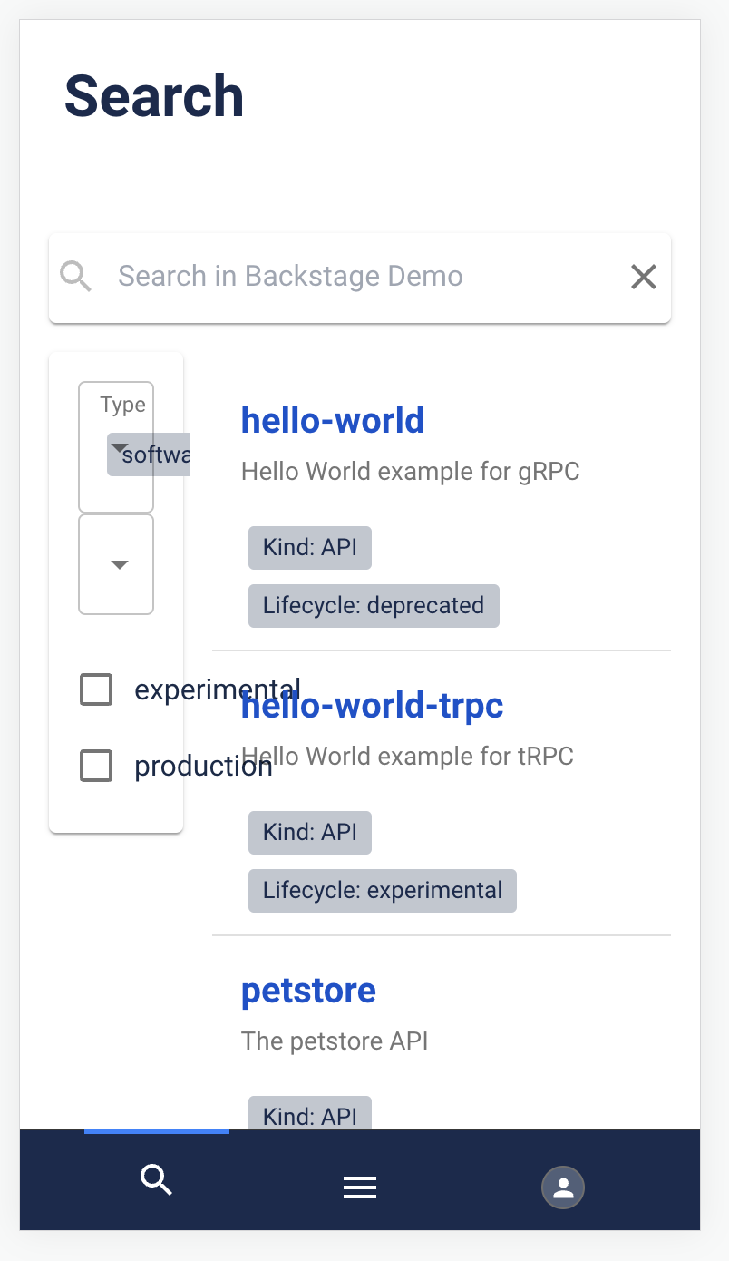 |
👟 Reproduction steps
- You can test the behaviour here: https://demo.backstage.io/search
- Tryout different width’s in your Responsiveness settings of your favourite Browsers Developer Tool
- If not modified by the instance the default breakpoints are: 960px >=
sm>= 600px > xs >= 0 (https://v4.mui.com/customization/breakpoints/#default-breakpoints)
📃 Provide the context for the Bug.
Creating this issue related to the thread here on Discord: https://discord.com/channels/687207715902193673/696709358544879716/1085236389995622410
🖥️ Your Environment
my environment is great - thanks for asking!
👀 Have you spent some time to check if this bug has been raised before?
- I checked and didn’t find similar issue
🏢 Have you read the Code of Conduct?
- I have read the Code of Conduct
Are you willing to submit PR?
No, but I’m happy to collaborate on a PR with someone else
About this issue
- Original URL
- State: closed
- Created a year ago
- Reactions: 1
- Comments: 15 (11 by maintainers)
@tudi2d Yes! I am happy to get started.